Web
ECharts renders to canvas by default, while uPlot handles dense series with tens of thousands of points. Marks and axes stay on canvas; legends remain real, selectable HTML.
High-performance, natively rendered graphs for web, iOS, and Android, designed for developers and coding agents.
yarn add @hzblj/zyplotECharts renders to canvas by default, while uPlot handles dense series with tens of thousands of points. Marks and axes stay on canvas; legends remain real, selectable HTML.
SwiftUI and Swift Charts, exposed through an Expo module. Native rendering, native gestures, zero WebViews.
A single Jetpack Compose Canvas renders marks, axes, and tooltips in one native view — without building a deep tree of components.
Examples
Five studies from the example app, on all three platforms.
Stocks
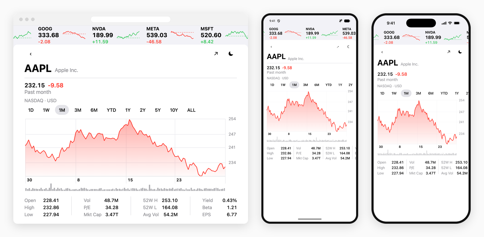
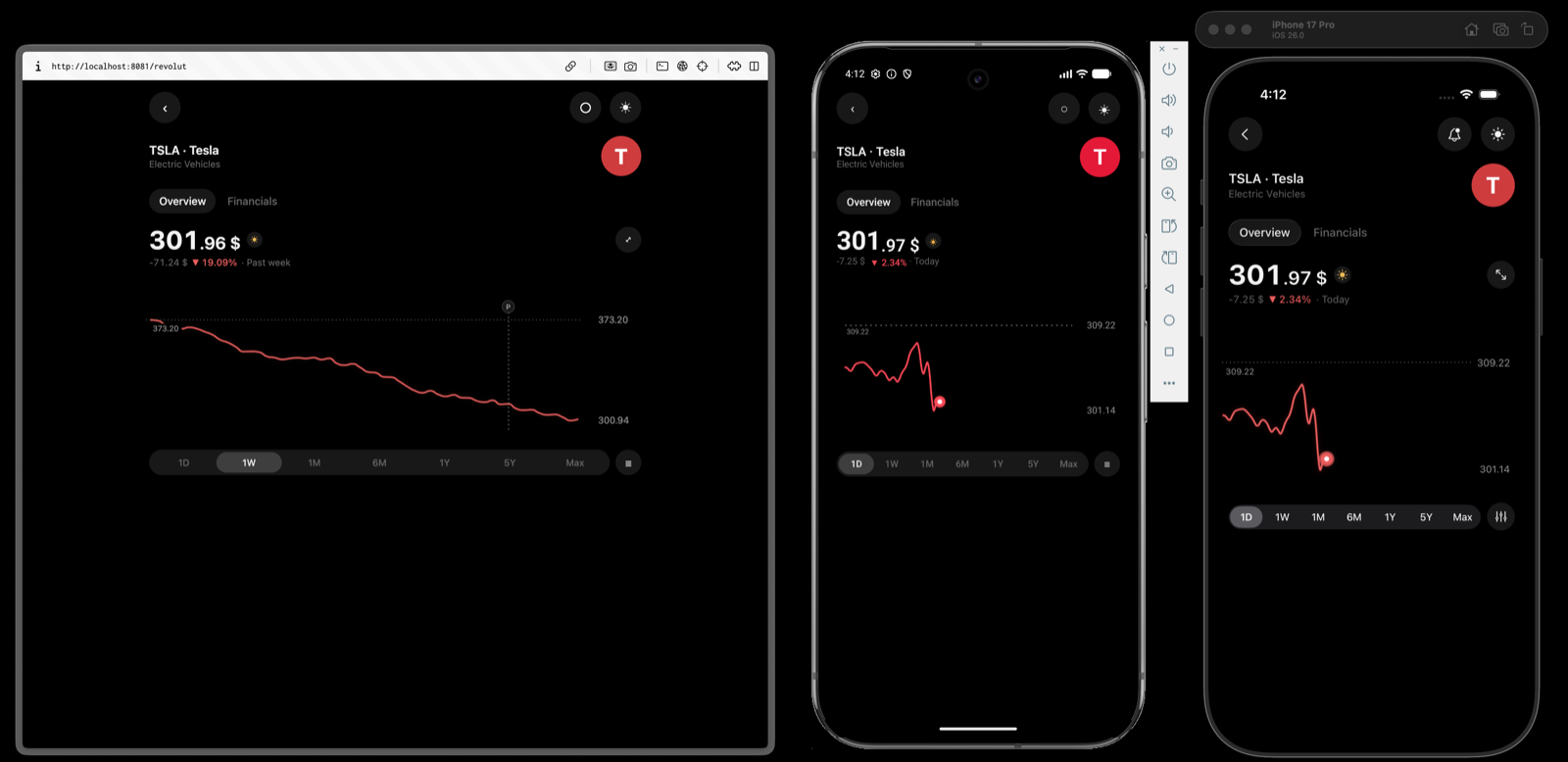
A headline price that tracks the scrub, a smoothed intraday line that stops where the session does, a range selector and a candlestick toggle — with native tabs and headers around all of it.
See how it is built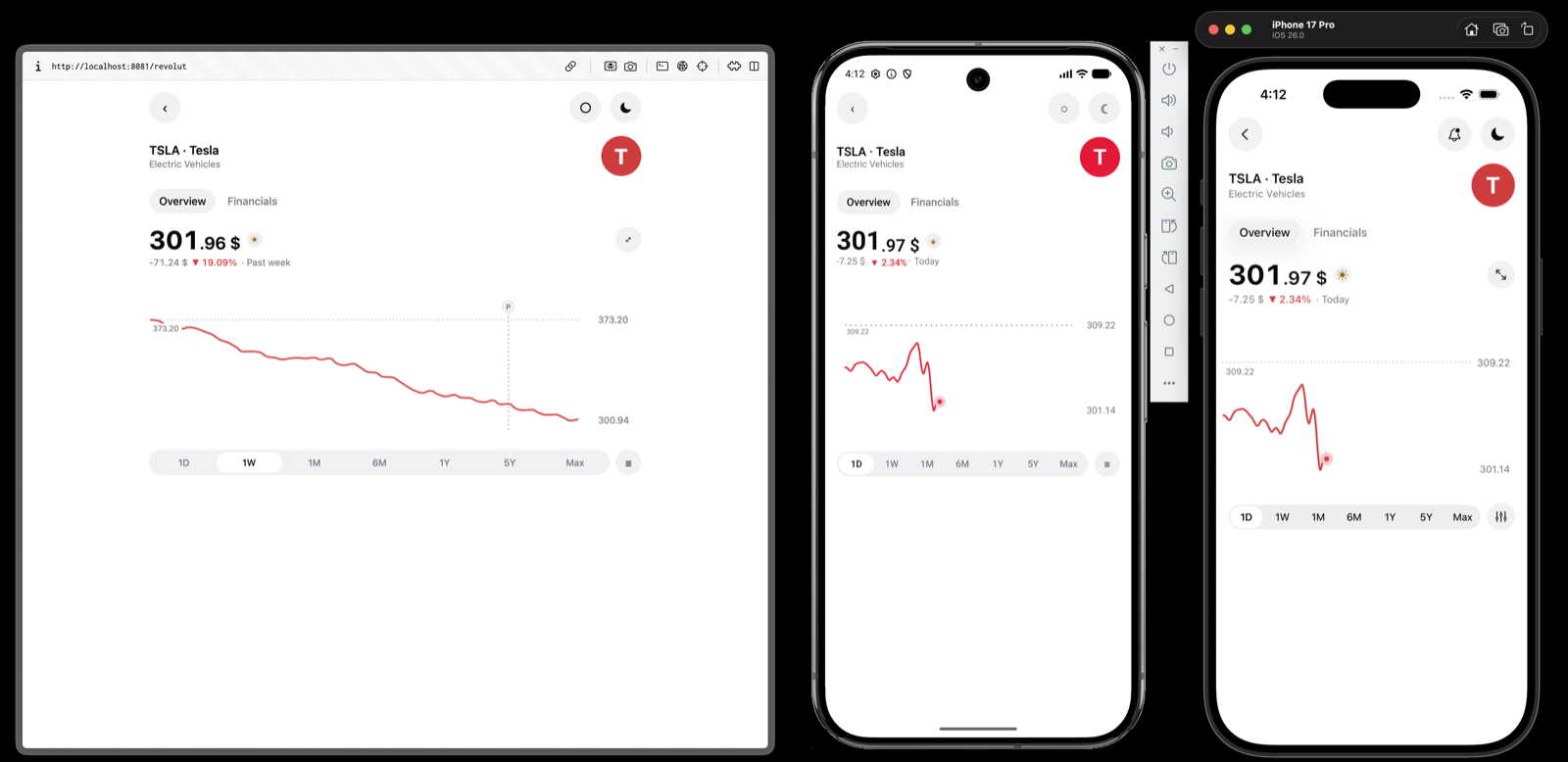
Crypto
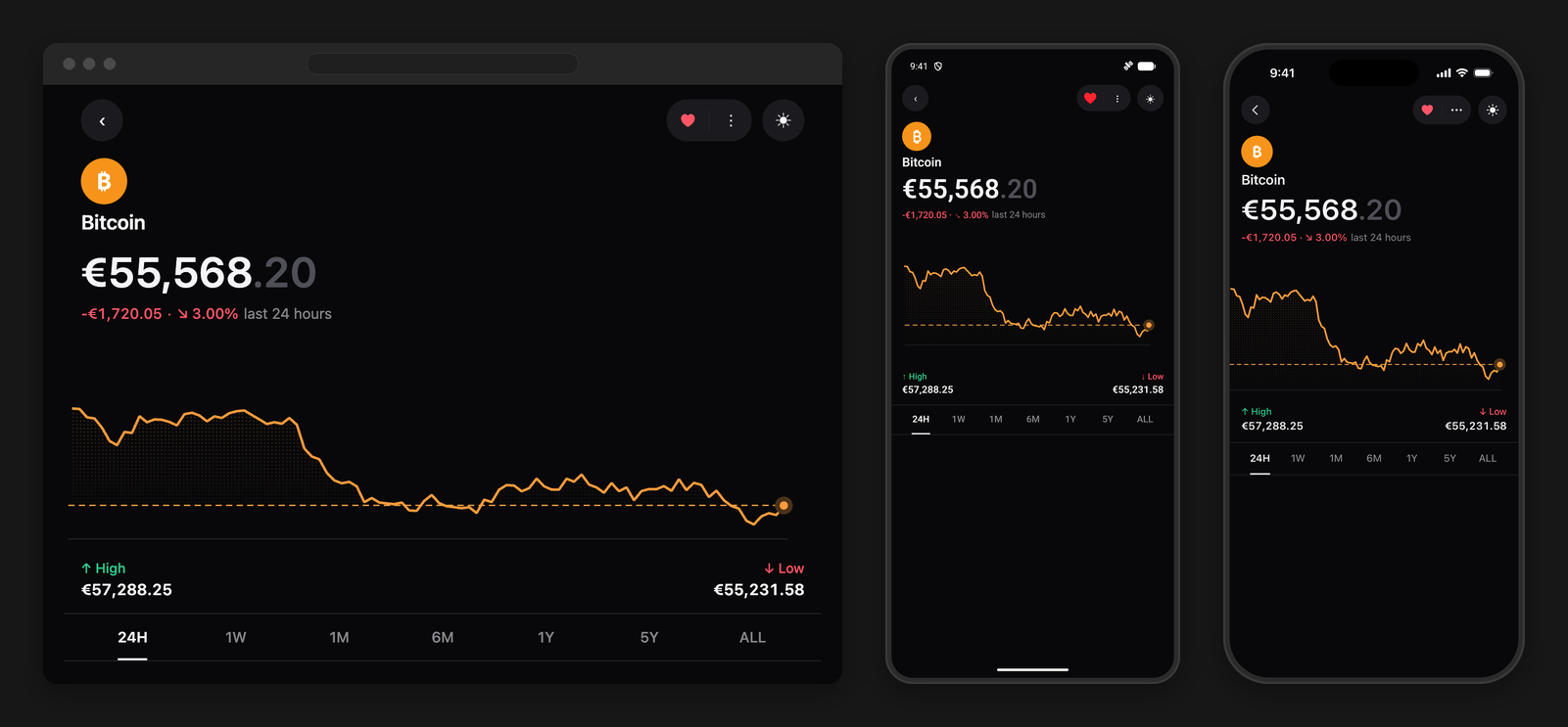
Price history that runs off both edges of the window, a dotted fill closed against the latest reading, the day's extremes underneath, and a scrub that lights the line up to the finger.
See how it is built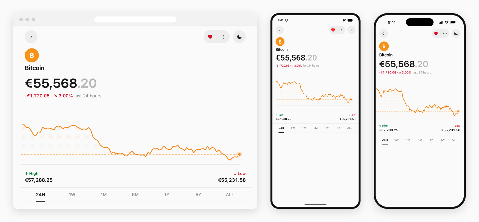
Tokens
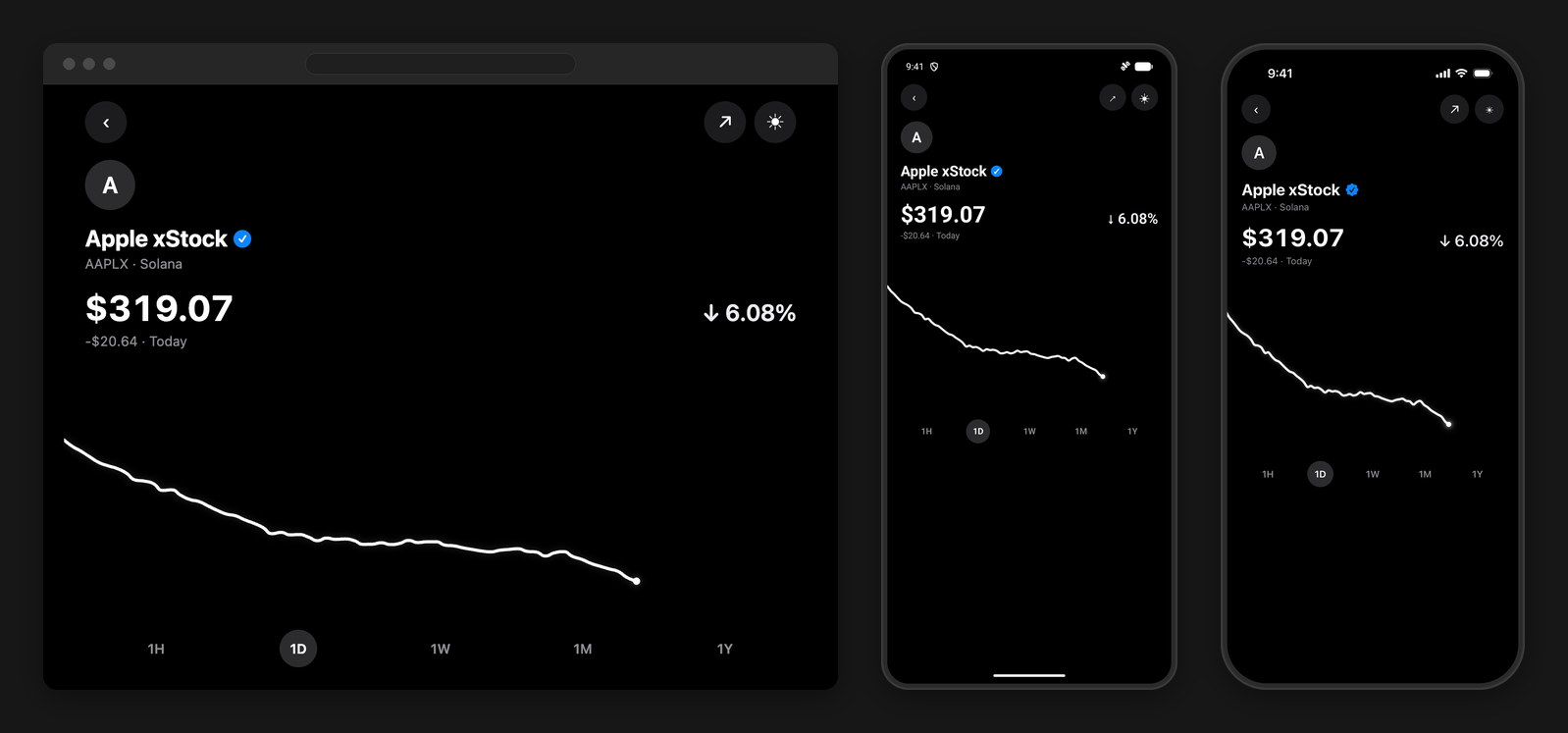
A resting wave that morphs into the window rather than a skeleton that is swapped for it, a step back that takes a beat when a finger lands, and a lit trail that holds until the rest of the trace has come back up.
See how it is built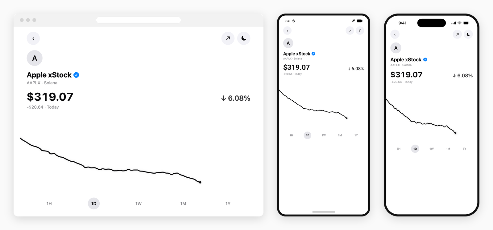
Fitness
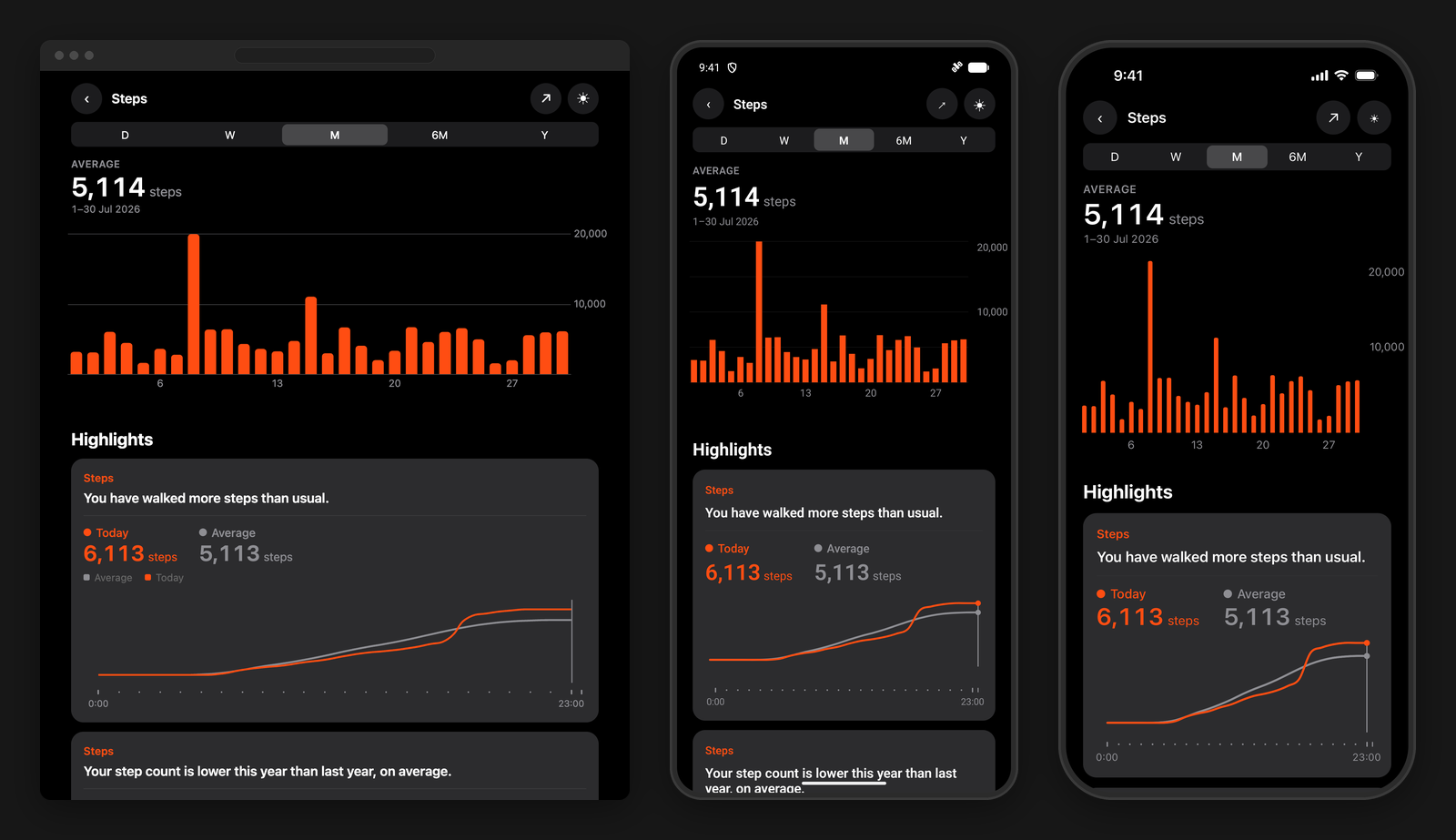
Two gridlines and no more, the daily counts written inside the plot against its trailing edge rather than in a gutter beside it, and a two-finger span that totals the days it covers.
See how it is built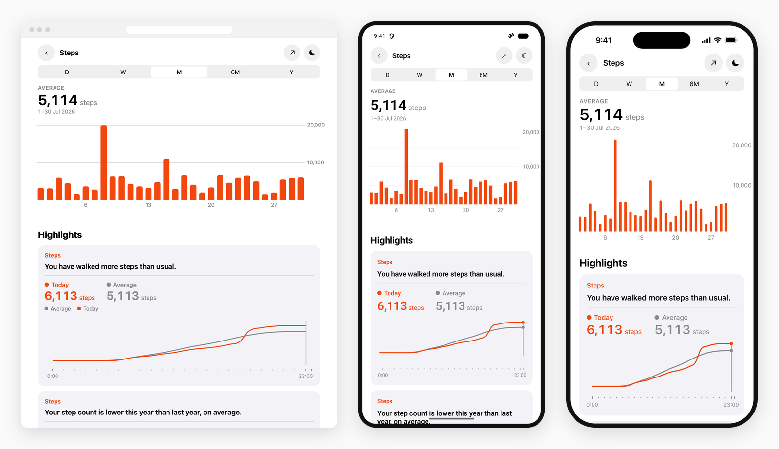
Markets
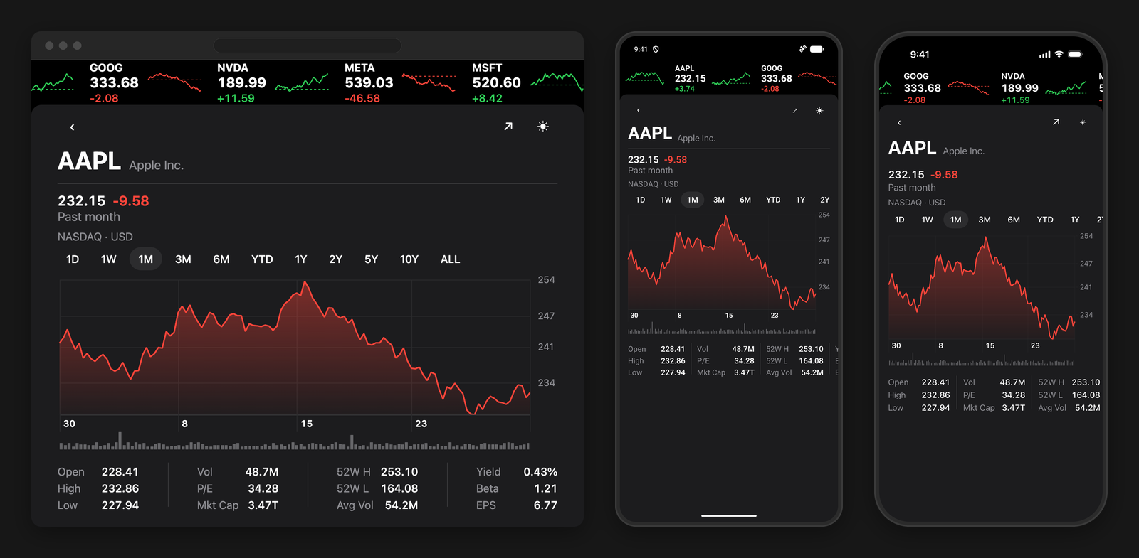
A grid, a row of dates and a volume tape all placed off marks the chart measured and nobody drew — and a held span painted in its own direction by whoever is drawing the line.
See how it is built