Getting started
One chart API. Native everywhere.
High-performance, natively rendered graphs for web, iOS, and Android, designed for developers and coding agents.
Getting started
High-performance, natively rendered graphs for web, iOS, and Android, designed for developers and coding agents.
One package covers every platform. There is nothing else to add for iOS or Android — the native modules ship inside it.
npm install @hzblj/zyplotbase cascade layer, where it loses to everything your app writes. Two builds of the same utility names would otherwise collide, with the one a chart pulled in coming second.A plain @hzblj/zyplot import resolves to the renderer the current target needs, and gives you the chart forms that exist everywhere. The three subpaths name a platform outright, and are how you reach forms only one renderer has.
| Prop | Type | Default | Description |
|---|---|---|---|
@hzblj/zyplot | any target | — | Resolves per target: ECharts and uPlot on the web, the native module under React Native. Exposes the twenty-one shared forms. |
@hzblj/zyplot/web | web | — | The DOM renderer, and the only entry with Chart.Frame, Chart.Legend and a .Skeleton on every form. |
@hzblj/zyplot/ios | iOS | — | Shared forms plus Chart.Range and Chart.Rule, and the Swift Charts scrolling options on xAxis. |
@hzblj/zyplot/android | Android | — | Shared forms plus Chart.Lollipop and Chart.Waterfall, and Compose label overflow on both axes. |
All four carry the builders and useLastReading, so a helper that assembles chart props is not tied to a platform. useChartScrub is on all four: a finger on the native entries, a pointer on the web one, reported as the same phases.
Web
@hzblj/zyplot/web draws in the DOM. A plain @hzblj/zyplot import already resolves here on every target except React Native, so naming the subpath only matters in a project that has both. It is also the only entry point that carries Chart.Frame, Chart.Legend and a .Skeleton on every form — all three are DOM composition with no native counterpart. Chart.Provider exists on every entry point, but only here does it take colorMode and a className.
Component names are the form, not the engine. Chart.Line and Chart.TimeSeries both draw a line — you pick between them on point count, never on renderer.
| Prop | Type | Default | Description |
|---|---|---|---|
ECharts | canvas | — | Eighteen of the twenty-one forms, Line through Treemap. Series types are registered per chart file, so a page with one line chart does not ship the sankey, sunburst and boxplot code. |
uPlot | canvas | — | Chart.TimeSeries and Chart.Sparkline. Tens of thousands of points, or forty sparklines in a table, where one scene graph per row would drop frames. |
Plain DOM | no engine | — | Chart.Meter is a filled track — two elements, role="meter" and no engine, so it is the only form whose final markup is painted on the server instead of after a first read off the document. |
animation — its duration, delay, easing, and enabled: false to turn the whole thing off — so one animation set on a page is one animation for every chart on it. The two uPlot forms and the meter draw their marks in one pass instead: Chart.Sparkline and Chart.Meter do not declare the prop, and Chart.TimeSeries accepts it with the rest of the base props and times nothing by it. animation.transition is not read here either: a data change moves the marks that are on both sides and fades the ones that are not, which is a better answer to a changed axis than dissolving the plot, so the web does it whichever name the prop is given.Only marks and axis ticks are painted into the canvas. The legend is React: every chart with two or more series renders one on its own, a single series never does, and the labels stay selectable, translatable and reachable by a screen reader.
Chart props stay serializable — no formatter callbacks, no render props — so a server component can render a chart without a client boundary of its own. Anything that would have been a callback is expressed as data instead, which is what ChartNumberFormat is for.
--zyplot-* values from the DOM after mounting and repaints when they change. Until that first read there is nothing honest to paint, so a chart that says nothing about isLoading covers that frame with its placeholder — which is what a server-rendered page wants, markup to paint before hydration. A chart mounted with its data already in hand can say isLoading={false} and have the plot fade in instead.Native
Zyplot ships an Expo module that draws with the platform's own graphics stack — Swift Charts on iOS, Jetpack Compose Canvas on Android — behind the same Chart namespace the web renderer exposes. There is no WebView.
The same single package you installed for the web carries the native code; autolinking picks it up. Rebuild the native project after adding it. These are native modules, so Expo Go cannot load them: use a development build.
yarn add @hzblj/zyplot

npx expo prebuild
npx expo run:ios
npx expo run:androidexpo-build-properties if your app targets something lower.Import from @hzblj/zyplot and the correct renderer is picked per platform — the same source builds for web, iOS and Android.
import { Chart } from '@hzblj/zyplot'

export function Revenue() {
  return (
    <Chart.Line
      categories={['Jan', 'Feb', 'Mar']}
      format={{ prefix: '$' }}
      series={[{ id: 'revenue', label: 'Revenue', values: [42, 56, 51] }]}
    />
  )
}A few forms exist on one platform only, because the underlying renderer has a mark the other has no honest equivalent for. They are not on the shared namespace — reaching for one would type-check and then render nothing on the platform that lacks it.
Instead, give the component one file per platform and let Metro choose. Write the shared parts once, import the platform entry point in the file that is already committed to that platform, and drop the Platform.OS branches entirely.
forecast.ios.tsx      imports @hzblj/zyplot/ios
forecast.android.tsx  imports @hzblj/zyplot/android
forecast.tsx optional web or fallback version// forecast.ios.tsx
import { Chart } from '@hzblj/zyplot/ios'
export const Forecast = ({ bands }: ForecastProps) => (
<Chart.Range data={bands} height={300} />
)// forecast.android.tsx
import { Chart } from '@hzblj/zyplot/android'
export const Forecast = ({ bands }: ForecastProps) => (
<Chart.Lollipop data={bands.map(toPoint)} height={300} />
)The call site imports ./forecast with no extension and never learns which one it got. This is the same convention Expo's own UI packages use.
tsc does not know about platform extensions, so ./forecast needs a plain forecast.tsx to resolve to. It doubles as the web version, or returns null if the component is native-only.All twenty-one shared chart kinds render on both native platforms, and each platform adds two of its own. Most take exactly the props documented under Charts; eleven differ, and they are listed below the coverage table.
| Prop | Type | Default | Description |
|---|---|---|---|
Cartesian | web · iOS · Android | — | Line, Area, Bar, StackedBar, TimeSeries, Sparkline, Scatter, Histogram. |
Radial and flow | web · iOS · Android | — | Pie, Gauge, Meter, Radar, Sunburst, Treemap, Funnel, Sankey. |
Statistical and finance | web · iOS · Android | — | Candlestick, Boxplot, DivergingBar, Dumbbell, Heatmap. |
iOS extensions | iOS only | — | Chart.Range and Chart.Rule, built on Swift Charts marks with no web equivalent. |
Android extensions | Android only | — | Chart.Waterfall and Chart.Lollipop, with no web equivalent. |
Where a form's data prop is named differently, or a web-only option has no native counterpart, the compiler says so — these are separate prop types, not one type with fields the native renderer drops.
| Prop | Type | Default | Description |
|---|---|---|---|
Chart.Funnel | stages → data | — | The stages are data on native. Same ChartDatum[], same order. |
Chart.Sunburst · Chart.Treemap | nodes → data | — | The hierarchy is data on both forms natively. |
Chart.Pie | innerRadius | — | Native takes innerRadius, a fraction that hollows the middle, instead of the web isSolid, maxSlices and otherLabel. Fold the tail yourself before passing the data. |
Chart.Gauge | label, optional max | — | Native adds label, and max is optional there — it defaults to 100. |
Chart.Meter | gauge props | — | Native takes the gauge props — value, max, min, label — so there is no showValue, and label is optional. |
Chart.Dumbbell | no beforeLabel / afterLabel | — | Native takes rows alone; label the two ends in your own view. Both platforms read the pair off each row. |
Chart.Histogram | no valueFormat | — | Use format for the bin boundaries on native — it is on every native chart. |
Chart.DivergingBar | no orientation | — | Bars always run horizontally on native. |
Chart.Sparkline | no slot | — | Native takes an explicit color instead of a palette slot. |
Chart.Candlestick | adds labels | — | Native takes labels — your five words for open, high, low, close and change — and the tooltip then lists every reading instead of just the close. |
Five of the option groups take a wider shape than the plain contract: seriesStyles, animation, interaction, annotations and the two axes. The wider shapes are the Native* types, they are supersets, and they are what every renderer takes — the web one included. A glow, a traced entrance, a selection marker and a pulsing point are all drawn in the DOM too.
| Prop | Type | Default | Description |
|---|---|---|---|
seriesStyles | NativeChartSeriesStyle | — | Adds glow — a bloom behind the stroke, in the series colour unless told otherwise — and fill, the area under a trace: a wash or a grid of dots, closed against the plot floor or against a value. |
animation | NativeChartAnimation | — | Adds reveal, the first-render entrance, and transition, how marks move when data changes. |
interaction | NativeChartInteraction | — | Adds marker — how the reading under the finger is picked out — and crosshairStyle, including the labels the crosshair carries above the plot. |
annotations | NativeChartAnnotation[] | — | Adds badge, glow, halo, hidden, pulse, labelBackground, labelPosition and scrubOpacity to lines and points. |
xAxis · yAxis | NativeChartAxisOptions | — | Adds the overlay position, labelInset, labelSize, ticks and the two plot-dimension paddings. Listed below under axis options. |
Native*. Five fields are still native alone: animation.transition, which the web renderer answers its own way — mark by mark, whichever name it is given — interaction.haptics, which the web has no honest equivalent for, style.candleRadius, which the web candlestick engine cannot round, and style.neutralColor and style.volumeHeightRatio — the web candlestick colours a flat session as a rising one and gives the volume histogram a fixed share of the plot.glow, halo, pulse, badge and size on an annotation land on Chart.Line and Chart.Candlestick on every platform, and on the rest of the cartesian forms on iOS and Android. On a web Chart.Area, Chart.Bar or Chart.StackedBar a point annotation is a plain mark and a rule carries no badge — the rules, ranges, labels and labelBackground those forms do draw are the engine's own, and annotationViews works on all five, so your own node is the way to put a head on a mark there.type ChartGlow = {
/** Defaults to the mark’s own colour. */
color?: string
opacity?: number
radius?: number
}
/** A hard disc behind a point. Unlike a glow it has an edge. */
type ChartHalo = {
color?: string
opacity?: number
size?: number
}
/** The area under a trace. Opacity stays fillOpacity, so there is one place to set it. */
type ChartSeriesFill = {
/** The value the fill closes against instead of the plot's floor, filling either side of it. */
baseline?: number
/** One dot's diameter, in points. Default 1. */
dotSize?: number
/**
* How much of its strength the fill still has at the plot's floor, 0–1. Default 1,
* which is an even fill. On the web it needs an explicit height: the ramp is baked
* into a tile before the chart is measured, and a chart that has not said how tall
* it is keeps an even fill rather than guessing at one.
*/
fadeTo?: number
/** "dots" | "solid" */
pattern?: ChartFillPattern
/** Centre-to-centre distance between dots, in points. Default 4. */
spacing?: number
}
type ChartPulse = {
/** Defaults to the glow's colour, then to the point's own. */
color?: string
/** One bloom, in ms. Default 450. */
duration?: number
/** The rest between blooms, in ms. Default 1550. */
interval?: number
/** How opaque the ring starts, before fading out over the bloom. Default 0.9. */
opacity?: number
/** How far it blooms, as a multiple of the point's resting ring. Default 2.2. */
scale?: number
}
type ChartRevealAnimation = {
/** "draw" | "fade" | "none" */
style?: ChartRevealStyle
duration?: number
/** "ease-in" | "ease-in-out" | "ease-out" | "linear". Defaults to "linear" for a trace. */
easing?: ChartRevealEasing
/** A brief brightening as the trace lands. "draw" only. */
flashColor?: string
flashDuration?: number
/** The curve the flash decays along once it has held. Defaults to "ease-out". */
flashEasing?: ChartRevealEasing
/** How far the glow blooms at the peak, as a multiple of its resting radius. */
flashGlow?: number
/** How long the flash holds at full strength before decaying. */
flashHold?: number
flashOpacity?: number
/** How dim the stroke starts while being traced, as a fraction of its final opacity. */
startOpacity?: number
/** Draws the whole path in this colour under the trace, so the shape reads from frame one. */
trackColor?: string
trackOpacity?: number
}
/** How marks move when the data changes under a mounted chart. */
type ChartTransition = 'crossfade' | 'morph'crossfade is the honest one when the axis changed. morph interpolates between the two datasets, which reads as the data moving. If the categories underneath are not the same categories, nothing moved — dissolve instead. It is a choice iOS and Android give you: on the web the renderer transitions a data change mark by mark on its own, moving the ones that are on both sides and fading the ones that are not, so neither name changes what you get.id — one that exists on both sides slides, one that does not simply arrives. Where the series count or the reading count differs there is nothing to interpolate, so the new dataset is shown as it is: a screen switching between a day and a year has to sample both into the same number of slots to be morphed between. animation.duration and animation.easing time it — 320 ms and ease-in-out by default, and 'spring' resolves to that curve, since a transition that overshot would carry the marks past their new values and back. A morph cut short sets off from what is on screen rather than from the dataset the last one was heading for.Chart.Line and Chart.Area, on all three renderers — a clipped dot grid on the SwiftUI and Compose canvases, a repeating canvas pattern on ECharts. Giving a Chart.Line a fill is what paints an area under it, where the fill is decoration; Chart.Area fills by default because there it is the quantity, and a fill only changes its pattern and its baseline. Opacity stays fillOpacity for both, and a dot grid usually wants more of it than a wash, since most of what it covers stays bare.These are the fields the builders exist for. reveal.draw and reveal.fade accept only the fields their own style reads, and glow and halo give the nested objects a name you can declare once and reuse.
Three fields carry a scrub: index, the mark's position in the data you passed, phase, where the gesture is in its lifetime, and geometry. Together they are what lets a readout outside the plot follow a finger and then return to rest. One phase is not a gesture at all: 'layout' fires once the chart has measured itself and carries the geometry, which is what you position your own views over the plot with. All three are reported on the web too, from the pointer.
Every coordinate in an event — geometry and the pointer's nativeX/nativeY — is in the unit the platform lays views out in: points on iOS, dp on Android, px on the web. So a view positioned from one lands where the chart drew, with no density arithmetic in between.
type ChartInteractionPhase = 'began' | 'changed' | 'ended' | 'layout'

type ChartInteractionEvent = {
  /** Position of the selected mark in the chart’s own data order. */
  index?: number
  phase?: ChartInteractionPhase
  /** Where the plot and its annotations sit, on the "layout" phase. */
  geometry?: ChartGeometry
  // … plus category, value, seriesId and the pointer position
}

type ChartGeometry = {
  annotations: readonly { id: string; x: number; y: number }[]
  plot: { height: number; width: number; x: number; y: number }
}

/** How the mark under the finger is picked out. */
type ChartSelectionMarker = {
  /** "point" | "segment" | "trail" */
  style?: ChartMarkerStyle
  color?: string
  glow?: ChartGlow
  /** A dot’s diameter. "point" only. */
  size?: number
  /** How many data steps either side of the touch a segment covers. "segment" only. */
  span?: number
}

type ChartCrosshairStyle = {
  color?: string
  dash?: number[]
  /** What to write above the crosshair: one string per slot, in data order. */
  labels?: string[]
  /** Defaults to the theme’s label colour. */
  labelColor?: string
  /** Point size of the label. Default 13. */
  labelSize?: number
  width?: number
}| Prop | Type | Default | Description |
|---|---|---|---|
marker.style | "point" | "segment" | "trail" | "point" | A dot on the mark, a lit stretch of the line around it, or a lit stretch from the first reading up to it. |
marker.size | number | 9 | Dot diameter, in points. |
marker.span | number | 2 | Data steps either side of the touch. A trail reaches back to the first datum, so it reads neither this nor size. |
glow.opacity | number | 0.55 | Glow opacity at rest. |
glow.radius | number | 6 | Glow radius, in points. |
halo.size | number | 12 | Halo diameter, in points. |
crosshairStyle.width | number | 1 | Crosshair line width. |
crosshairStyle.labels | string[] | — | What the crosshair writes above the plot: one string per slot, in data order, and the chart draws the one for the mark being read. Your words — a time, a date, whatever the reading is called. |
crosshairStyle.labelColor | string | — | Colour of that label. Defaults to the theme’s label colour on all three renderers. |
crosshairStyle.labelSize | number | 13 | Point size of the label. Also what the web plot gives up at the top to fit it. |
annotation.pulse | boolean | ChartPulse | false | A ring blooming out of a point annotation and resting before it does it again, to mark "now". true takes 450 ms out, 1550 ms at rest, 2.2× the point’s ring. |
annotation.labelBackground | string | — | Painted behind an annotation’s label, so its value stays legible where the marks run through it. |
annotation.labelPosition | "auto" | "bottom" | "leading" | "top" | "trailing" | — | Which side of the rule its label sits on. "auto" keeps it inside the plot: above a rule sitting low, below one sitting high. Omit it and each renderer keeps its own default side, so name one when the three have to agree. |
interaction.highlightColor | string | — | A colour the mark under the finger is lifted towards, so the read one reads as lit. |
interaction.highlightBlend | number | 1 | How far towards it. Below 1 the mark’s own colour still reads through the lift. |
style.candleRadius | number | 0 | Corner radius on a candle body. Rounds the wick’s caps with it. |
annotation.scrubOpacity | number | 1 | What an annotation fades to while a point is being read. Set 0 to hide it entirely. |
annotation.badge | string | — | A single glyph in a filled circle capping a rule at the plot edge; the rule starts below it. Leave it off and the chart draws only the rule, so your own view can sit there instead. |
annotation.size | number | — | A point annotation’s dot diameter, or a badge circle’s. Each renderer rests at a slightly different dot size, so name it when the three have to agree; a badge takes it on iOS and the web, and Android draws a fixed one. |
annotationViews | Record<string, ReactNode> | — | Your own node where an annotation lands, keyed by its id. The chart centres it on the spot and leaves out the mark it draws there itself. |
annotation.hidden | boolean | false | Measured and reported in geometry as usual, but drawn by nobody — for an annotation that is only an anchor for a view of your own. |
onInteraction to place it — a card against a rule, a badge on an annotation. A label that has to move with the line cannot: a position that reaches JavaScript through a bridge and comes back as a re-render is a frame or two behind the line it belongs to, and read together the label visibly drags. So crosshairStyle.labels hands the words to whoever is drawing the line. All three renderers keep the label whole against both edges of the chart, so the first and last readings of a series are worth a full label rather than half of one, and on the web the plot gives up labelSize plus 8px at the top to draw it in — only when labels were given and a crosshair is drawn at all, and whether or not a pointer is over the plot: marks that changed height the moment one arrived would be worse than either.useChartScrub before writing a handler. It already turns these events into a selection that clears itself on 'ended', which is the whole of what a readout above the plot needs.xAxis and yAxis take everything ChartAxisOptions defines, plus the controls below on both platforms. Each renderer then adds its own — see iOS and Android.
| Prop | Type | Default | Description |
|---|---|---|---|
position | "start" | "end" | "overlay" | "start" | overlay puts the labels inside the plot against its trailing edge and reserves no gutter, keeping the full width for the marks. Build it with axis.overlay. |
labelInset | number | 2 | How far an overlaid label sits from the plot’s trailing edge. Only read when position is overlay. |
labelSize | number | 11 | Point size of the tick labels. |
ticks | boolean | true | Draws the short marks beside each label. Independent of grid, and coloured by theme.colors.axis, which is the only thing either renderer draws with it — neither Swift Charts nor a Compose canvas draws a domain line. |
plotDimensionStartPadding | number | 0 | Free space, in points, kept before the first mark. |
plotDimensionEndPadding | number | 0 | Free space, in points, kept after the last mark. |
| Prop | Type | Default | Description |
|---|---|---|---|
className | web only | — | Native charts have no DOM node to style. Use height and plot instead. |
texture | web only | — | Pattern fills answer forced-colors and print, which a native chart never meets. Not part of the native props — the compiler rejects it rather than the renderer ignoring it. |
skeleton | web only | — | Both native renderers draw a shimmering placeholder matched to the form — a ring, a column row or a curve — but there is no slot to put your own in, and no .Skeleton component to mount on its own. |
annotationViews | wider on native | — | On every native form’s props, and it lands on the ones that anchor an annotation to a plot — the cartesian forms. On the web it is Chart.Line, Chart.Area, Chart.Bar, Chart.StackedBar and Chart.Candlestick, the forms that report where their annotations landed. |
colorMode | native chart · web provider | "system" | Per chart on native: there is no cascade to inherit through, so Chart.Provider scopes surface and theme but not the color mode. On the web it is the provider that takes it, and it has an "inherit" the native prop does not. |
accessibilityLabel | native only | — | The accessibility name of the chart view, since there is no DOM node to label. On the web, use className and the surrounding markup. |
format | every native form | — | On the base props natively, so every form takes it. On the web only the forms that write numbers do, and a few take a second one — valueFormat on the histogram, xFormat and yFormat on the scatter. |
height | different default | 320 | Points on native, px on the web, where it defaults to 240 — and to 200 for the gauge and 300 for the sankey. |
labels | wider on native | — | Boxplot terminology is honoured natively too. Chart.Candlestick takes labels only here — pass your five words and the tooltip lists every reading instead of just the close. |
glow, reveal, marker, badge, pulse, halo and the overlaid axis all render in the DOM as well — see the presentation vocabulary above. Only interaction.haptics, style.candleRadius, style.neutralColor and style.volumeHeightRatio are native alone. Eleven forms do take different data props, though: those are in chart coverage.type ChartCandlestickLabels = {
open: string
high: string
low: string
close: string
change: string
}Native
@hzblj/zyplot/ios renders with SwiftUI and Swift Charts. Chart configuration crosses the bridge as JSON and is decoded into native models, so every prop stays serializable. Importing it commits a file to iOS, so name that file *.ios.tsx.
// price.ios.tsx
import { Chart } from '@hzblj/zyplot/ios'

export function Price() {
  return (
    <Chart.Candlestick
      data={candles}
      format={{ prefix: '$' }}
      onInteraction={(event) => console.log(event.category, event.value)}
      showVolume
    />
  )
}Two marks Swift Charts has that neither other renderer does.
| Prop | Type | Default | Description |
|---|---|---|---|
Chart.Range* | ChartRangePropsIos | — | Shaded band between a low and a high per category — forecast ranges, confidence intervals. |
Chart.Rule* | ChartRulePropsIos | — | Reference rules at a value, optionally spanning a start and end. |
xAxis and yAxis accept everything the shared native axis defines — the overlay position, labelInset, labelSize, ticks and the two plotDimension paddings among them — plus these Swift Charts scrolling controls, which belong to the x axis alone.
| Prop | Type | Default | Description |
|---|---|---|---|
xAxis.visibleDomain | number | — | Length of the visible x domain. Setting it makes the plot horizontally scrollable. |
xAxis.scrollPosition | number | string | — | Initial scroll offset along the x axis. |
Native
@hzblj/zyplot/android draws on a Jetpack Compose Canvas. Marks, axis text, grid, annotations and the tooltip are all drawn by the module, so a chart is one view rather than a tree of them. Importing it commits a file to Android, so name that file *.android.tsx.
// spend.android.tsx
import { Chart } from '@hzblj/zyplot/android'

export function Spend() {
  return (
    <Chart.Waterfall
      data={movements}
      format={{ prefix: '$', decimals: 0 }}
      interaction={{ haptics: true, tooltip: true }}
    />
  )
}Two forms the Compose Canvas draws that neither other renderer does.
| Prop | Type | Default | Description |
|---|---|---|---|
Chart.Waterfall* | ChartWaterfallPropsAndroid | — | Running total across signed movements, colored by direction. |
Chart.Lollipop* | ChartLollipopPropsAndroid | — | A stem and a dot per category — a bar chart with the ink of a dot plot. |
xAxis and yAxis accept everything the shared native axis defines, plus overflow handling for long tick labels — the one control Compose needs that Swift Charts resolves on its own.
| Prop | Type | Default | Description |
|---|---|---|---|
xAxis.labelOverflow | "clip" | "ellipsis" | "visible" | "ellipsis" | How a tick label that exceeds its band is cut. |
yAxis.labelOverflow | "clip" | "ellipsis" | "visible" | "ellipsis" | How a tick label that exceeds the gutter is cut. |
Chart.Provider scopes a palette to a subtree. It writes what you pass as --zyplot-* custom properties on its own wrapper, and the charts inside read the resolved values back off the DOM. A key you leave out keeps the stylesheet's value, including that value's dark variant.
<Chart.Provider
  theme={{
    colors: {
      categorical: ['#7c3aed', '#0284c7', '#ea580c'],
      grid: '#e5e7eb',
    },
    typography: {
      fontFamily: 'Geist, sans-serif',
    },
  }}
>
  <Dashboard />
</Chart.Provider>Every key is optional and takes any color the browser can resolve. There is no background here — the box a chart sits in is surface, below.
ChartProviderTheme. It is the full palette, because the provider writes CSS variables and the stylesheet has one for each of these. It is also a superset of the ChartTheme a single chart takes, so one object can be passed to both — see below.type ChartProviderTheme = {
colors?: {
/** Slots 1…7, in order. A series takes one by index or by its own slot. */
categorical?: readonly string[]
/** Low → high, five steps. Heatmap, treemap, sunburst. */
sequential?: readonly string[]
/** A signed scale in full. The flat negative/positive below are its shorthand. */
diverging?: {
negative?: string
negativeSoft?: string
neutral?: string
positive?: string
positiveSoft?: string
}
/** The de-emphasis grey — every series that is context rather than subject. */
muted?: string
axis?: string
grid?: string
/** Axis and data labels. */
label?: string
negative?: string
positive?: string
/** Tooltip fill. */
surface?: string
/** Tooltip hairline. */
border?: string
/** The unfilled part of a gauge or a meter. */
track?: string
}
typography?: {
/** A resolved family name. A canvas cannot read var(--font-sans). */
fontFamily?: string
}
}categorical entries and the first five sequential steps are ever read. An eighth series color is one no color-blind reader can separate from a slot that already exists, so the eighth series is an "other" bucket, a small multiple, or a second encoding through texture — not a longer palette.Every chart also takes a theme of its own, on all four entry points. This one is ChartTheme, and it is the portable subset: every key on it is a key each of the four renderers draws with, so a theme written against it works unchanged on the web, on iOS and on Android.
theme lands over them key by key — one colour here does not drop the rest. On native there are no variables to resolve against: a chart that passes a theme replaces the provider's outright, so restate the keys you still want, or leave the theme to the provider and style the chart with seriesStyles and surface instead. surface does merge key by key on both.import type { ChartTheme } from '@hzblj/zyplot'
type ChartTheme = {
colors?: ChartThemeColors
typography?: ChartTypography
}
type ChartThemeColors = {
axis?: string
/** Series colours, in the order series take them. */
categorical?: readonly string[]
grid?: string
label?: string
/** The negative half of a signed scale: a losing bar, a falling candle. */
negative?: string
positive?: string
/** Tooltip fill. */
surface?: string
/** The unfilled part of a gauge or a meter. */
track?: string
}
/** The one colour only a native chart paints for itself. */
type NativeChartTheme = {
colors?: ChartThemeColors & { background?: string }
typography?: ChartTypography
}The two wider shapes build on that subset rather than beside it. ChartProviderTheme adds the palettes and greys only a CSS variable can carry; NativeChartTheme, which the native charts and the native provider take, adds the chart's own background. Both are supersets, so one ChartTheme value satisfies all three props.
--zyplot-color-background: in the DOM the box a chart sits on is surface.background, which exists on native too. Reach for that when one object has to dress a chart on every platform.typography.fontFamily takes a resolved family name. Each platform looks it up the way its own text does: the DOM through --zyplot-font-family, iOS through the registered-font lookup behind UIFont(name:), Android through React Native's font manager — which covers assets/fonts, res/font and anything expo-font loaded at runtime. So a family that works in a <Text> works in a chart. One the app never shipped falls back to the platform font on all three.theme answers "what colour is this series"; surface answers "what does the container look like". Keeping them apart is what lets a design system set one card treatment for every chart while each chart keeps its own palette.
<Chart.Provider surface={{ background: '#fff', cornerRadius: 16, padding: 12 }}>
  <Chart.Line categories={categories} series={series} />
  <Chart.Bar surface={{ cornerRadius: 24 }} categories={categories} series={series} />
</Chart.Provider>
A chart's own surface merges over the provider's key by key, so the bar above rounds its corners without restating the background it inherits.
| Prop | Type | Default | Description |
|---|---|---|---|
background | string | — | Fill behind the plot. Any CSS or hex colour. |
border | { color?: string; width?: number } | — | Outline around the container. |
cornerRadius | number | 0 | Corner rounding, in px on web and points on native. |
padding | number | ChartSurfacePadding | — | A number applies to all four sides; the object form takes horizontal, vertical and the individual sides, most specific winning. |
div, a SwiftUI view and a Compose Canvas live here. Anything that would have to be approximated on one of the three is deliberately absent.| Prop | Type | Default | Description |
|---|---|---|---|
children* | ReactNode | — | Charts rendered inside the scope. |
theme | ChartProviderTheme | — | Scoped color and typography overrides. A superset of a chart’s own ChartTheme. |
surface | ChartSurface | — | Container treatment every chart in the subtree inherits, merged key by key with the chart's own. |
colorMode | "inherit" | "light" | "dark" | "system" | "inherit" | How the light/dark palette is resolved for the subtree. |
className | string | — | CSS class on the wrapper element the provider renders. |
div in your layout rather than context alone. It carries className for that reason.Both palettes ship in the stylesheet. The dark one is keyed off .dark or data-theme="dark" on the document root — the two conventions Tailwind and next-themes already write — and a root that pins neither falls back to prefers-color-scheme. A project doing either needs no chart-specific wiring.
.dark leaves the root pinning nothing, so a reader on a dark OS keeps the dark palette while the rest of the page turns light. Write .light — or data-theme="light" — as the other half of the toggle.Chart.Provider pins a subtree instead. Its colorMode lands as data-zyplot-color-mode on the wrapper, and the stylesheet resolves the palette from there.
| Prop | Type | Default | Description |
|---|---|---|---|
"inherit" | document root | default | Takes whatever the document root resolved to, including the OS fallback. Charts outside a provider behave this way too. |
"light" | pinned | — | The light palette regardless of the root, plus color-scheme: light. |
"dark" | pinned | — | The dark palette regardless of the root, plus color-scheme: dark. |
"system" | media query | — | Follows the OS through prefers-color-scheme, ignoring the document root. |
class, data-theme, data-zyplot-color-mode and style on the root — plus the prefers-color-scheme query — and repaints from the new values. No remount, and no chart left painting light-mode series on a dark canvas.These names are the public API; the Tailwind tokens behind them are not. Override them wherever you set the rest of your theme — the values below are the light defaults, and every color among them has a dark counterpart in the stylesheet.
:root {
  /* Categorical: slots 1…7, in the order series take them. */
  --zyplot-color-categorical-1: #4400fc;
  --zyplot-color-categorical-2: #0092de;
  --zyplot-color-categorical-3: #ff5700;
  --zyplot-color-categorical-4: #9c74ff;
  --zyplot-color-categorical-5: #00a546;
  --zyplot-color-categorical-6: #006fac;
  --zyplot-color-categorical-7: #ff133c;

  /* Sequential: low → high. Heatmap, treemap, sunburst. */
  --zyplot-color-sequential-1: #b89bff;
  --zyplot-color-sequential-2: #9c74ff;
  --zyplot-color-sequential-3: #7135ff;
  --zyplot-color-sequential-4: #4400fc;
  --zyplot-color-sequential-5: #2f00ae;

  /* Diverging: signed scales. */
  --zyplot-color-diverging-negative: #d23100;
  --zyplot-color-diverging-negative-soft: #ff7d4f;
  --zyplot-color-diverging-neutral: #d9d9d9;
  --zyplot-color-diverging-positive-soft: #59c4fd;
  --zyplot-color-diverging-positive: #006fac;

  /* Chrome. */
  --zyplot-color-axis: #a6a6a6;
  --zyplot-color-grid: #f5f5f5;
  --zyplot-color-label: #666666;
  --zyplot-color-muted: #808080;
  --zyplot-color-surface: #fcfcfc;
  --zyplot-color-border: #f5f5f5;
  --zyplot-color-track: #ebebeb;

  --zyplot-font-family: inherit;
}

/* Only the keys you actually change need restating per mode. */
[data-theme='dark'] {
  --zyplot-color-categorical-1: #7135ff;
  --zyplot-color-grid: #212121;
}
The font is inherited from the page. Set --zyplot-font-family only when charts should use a different stack, and give it a resolved family name — a canvas cannot read another variable.
system-ui and the platform stack behind it. React Native Web is the case this exists for: its reset puts no font on the document and styles each <Text> on its own, so a chart has nothing to inherit however deeply it looks — with the fallback it matches the text beside it instead.color(display-p3 …), which ECharts' own parser rejects. Every color is normalized to sRGB on the way to the canvas, so the variable can hold whatever your design tokens hold.Chart data is plain serializable objects — no formatter callbacks and no render props, which is what lets a server component render a chart. Labels are already translated: this package never resolves an i18n key. Type names in the props tables link here.
series, categories, data, nodes, cells, groups, rows, values — accepts a readonly array, so an as const value or a readonly-returning selector needs no cast. The shapes below are written as plain arrays for legibility.Used by line, area, bar, stacked bar, radar and every other multi-series form. Each values entry aligns with the category at the same index, so the array is as long as categories.
type ChartSeries = {
  /** Stable identity: the React key, and how hover correlates across charts. */
  id: string
  /** Already-translated display name, used by the legend and the tooltip. */
  label: string
  /** One value per category. null is a genuine gap, drawn as one, never as zero. */
  values: (number | null)[]
  /** Palette slot, 1-based. Pin it when the caller can hide series. */
  slot?: number
  /** Overrides the active palette for this series. */
  color?: string
}
An explicit color wins over the provider palette and the CSS variables. Omit slot and a series takes its index — correct for a fixed list, wrong the moment the list can be filtered, because the survivors get repainted and the reader has to re-learn the chart.
const series: ChartSeries[] = [
  {
    id: 'revenue',
    label: 'Revenue',
    values: [42, 56, null, 72],
    slot: 1,
    color: '#16a34a',
  },
]A labelled scalar — the shape part-to-whole and ranked forms consume: pie, funnel, gauge segments, diverging bars.
type ChartDatum = {
  id: string
  label: string
  value: number
  slot?: number
  color?: string
}axis is the on/off switch both cartesian axes share; format is one description of a number, applied to axis ticks, tooltips and direct labels alike, so they can never disagree.
type ChartAxes = {
  x?: boolean
  y?: boolean
}

type ChartNumberFormat = {
  /** Fraction digits. Defaults to 0. */
  decimals?: number
  /** BCP 47 tag for grouping and decimal separators. Defaults to the runtime locale. */
  locale?: string
  /** Rendered before the number — a currency symbol, typically. */
  prefix?: string
  /** Rendered after the number — a unit or a percent sign. */
  suffix?: string
}What Chart.Legend takes when you place identity yourself. The color is already resolved — a swatch is a color, not a slot to look up.
type ChartLegendItem = {
  id: string
  label: string
  color: string
}Some forms take a shape-specific contract instead of ChartSeries, because their encoding is not "one value per category". The field names describe the marks directly.
/** Chart.Radar — one axis per row. Axes are scaled independently. */
type ChartRadarAxis = {
  label: string
  max: number
}

/** Chart.Heatmap — addressed by axis index; null renders empty, not as the ramp's low end. */
type ChartHeatmapCell = {
  columnIndex: number
  rowIndex: number
  value: number | null
}

/** Chart.Dumbbell — a before → after pair per row. */
type ChartDumbbellRow = {
  id: string
  label: string
  before: number
  after: number
}

/** Chart.Boxplot — the five-number summary, plus outliers you have already picked. */
type ChartBoxplotGroup = {
  id: string
  label: string
  min: number
  q1: number
  median: number
  q3: number
  max: number
  outliers?: number[]
}

/** Required, because "Q1" is not a word every reader of your product knows. */
type BoxplotLabels = {
  min: string
  q1: string
  median: string
  q3: string
  max: string
}

/** Chart.Sankey — nodes, and the weighted edges that address them by id. */
type ChartFlowNode = {
  id: string
  label: string
  slot?: number
  color?: string
}

type ChartFlowLink = {
  source: string
  target: string
  value: number
}

/** Chart.Treemap and Chart.Sunburst — leaves carry a value, parents sum their children. */
type ChartHierarchyNode = {
  id: string
  label: string
  value?: number
  children?: ChartHierarchyNode[]
  slot?: number
  color?: string
}

/** Chart.Scatter — an unordered two-measure space. size turns points into bubbles. */
type ChartScatterSeries = {
  id: string
  label: string
  points: Array<{
    x: number
    y: number
    size?: number
    label?: string
  }>
  slot?: number
  color?: string
}

/** Chart.TimeSeries — parallel arrays, because that is what uPlot consumes. */
type ChartTimePoints = {
  /** Unix seconds, strictly ascending. */
  timestamps: number[]
  /** One entry per series, each as long as timestamps. */
  values: (number | null)[][]
}One entry per session. volume is what showVolume draws, and timestamp is only needed when something outside the chart has to line up with the session.
type ChartCandlestickDatum = {
  id: string
  category: string
  open: number
  high: number
  low: number
  close: number
  volume?: number
  /** Unix seconds. */
  timestamp?: number
}

type ChartCandlestickStyle = {
  upColor?: string
  downColor?: string
  neutralColor?: string
  /** Draws rising candles as outlines — the convention on most trading desks. */
  hollowUp?: boolean
  /** Corner radius on the candle body. Rounds the wick's caps with it. */
  candleRadius?: number
  /** Body width as a share of the slot a candle sits in. */
  candleWidth?: number
  wickWidth?: number
  volumeUpColor?: string
  volumeDownColor?: string
  /** Share of the plot height the volume histogram takes. */
  volumeHeightRatio?: number
}axis switches an axis off; xAxis and yAxis describe one. Both are read by line, area, bar, stacked bar and candlestick — the forms whose readers pin a domain, change the scale or annotate a value. The other forms take the visibility switch only, which is why their props tables list axis alone.
type ChartAxisOptions = {
  /** Draws the axis at all. Switching one off takes its grid with it — the rules belong to the scale. */
  visible?: boolean
  label?: string
  /** "auto" | "category" | "linear" | "log" | "time" */
  scale?: ChartAxisScale
  domain?: ChartAxisDomain
  format?: ChartNumberFormat
  /** The rules across the plot. Turn them off on their own for an axis you still want labelled. */
  grid?: boolean
  gridDash?: number[]
  labelRotation?: number
  /** Which side the axis is drawn on: "start" | "end". */
  position?: ChartAxisPosition
  reversed?: boolean
  /** A hint, not a guarantee — the engine still picks readable ticks. */
  tickCount?: number
  /** Exact ticks, when the reader is looking for specific ones. */
  tickValues?: (number | string)[]
}

type ChartAxisDomain = {
  /** Pins the extent. Omit either end to keep it computed from the data. */
  min?: number
  max?: number
  /**
   * Headroom kept beyond the data, as a fraction of its extent — 0.08 leaves 8%
   * clear at each end. Applies only to an end that is computed, so it combines
   * with a single pinned one.
   */
  padding?: number
}padding before pinning a domain. Without it a line runs into the top and bottom of its own plot, which reads as clipped rather than as the highest and lowest reading. A pinned min/max fixes that too, but it has to be recomputed every time the data changes; a fraction does not.A union discriminated on type. Coordinates are number | string: a category name on a category axis, a value on a linear or time one.
type ChartAnnotation =
  | ChartLineAnnotation
  | ChartRangeAnnotation
  | ChartPointAnnotation
  | ChartTextAnnotation

/** A target, a threshold, a launch date. */
type ChartLineAnnotation = {
  type: 'line'
  id: string
  axis: 'x' | 'y'
  value: number | string
  label?: string
  color?: string
  /** Dash and gap lengths. Omit for a solid rule. */
  dash?: number[]
  /** Rule thickness. Default 1. */
  width?: number
}

/** A shaded span — a quarter, an incident window, a tolerance band. */
type ChartRangeAnnotation = {
  type: 'range'
  id: string
  axis: 'x' | 'y'
  start: number | string
  end: number | string
  label?: string
  color?: string
  opacity?: number
}

type ChartPointAnnotation = {
  type: 'point'
  id: string
  x: number | string
  y: number
  label?: string
  color?: string
  symbol?: ChartSymbol
}

type ChartTextAnnotation = {
  type: 'text'
  id: string
  text: string
  x?: number | string
  y?: number
  color?: string
}interaction is what the chart does on its own; onInteraction is how your code hears about it. The event is one flat serializable shape for every form, so a handler written for a bar chart works on a line chart.
type ChartInteraction = {
  /** "axis" | "nearest" | "series" | "none" */
  hover?: ChartHoverMode
  /** "both" | "x" | "y" | "none" */
  crosshair?: ChartCrosshairMode
  tooltip?: boolean
  /** "single" | "multiple" | "none" */
  selection?: ChartSelectionMode
  pan?: boolean
  zoom?: boolean
  /** How far a hovered mark grows. */
  highlightScale?: number
  /**
   * How far the rest fades while one mark is hovered. It reaches the strokes and the marks,
   * never the area fill under a trace: that is the ground the trace is drawn on, not one of
   * the things being compared, and greying it dims the page rather than pointing at anything.
   */
  dimOpacity?: number
  /** A colour the read mark is lifted towards, so it reads as lit rather than as undimmed. */
  highlightColor?: string
  /** How far towards it, 0–1. Below 1 the mark's own colour still reads. Default 1. */
  highlightBlend?: number
  /** Native only — the web has no honest equivalent. */
  haptics?: boolean
}

type ChartInteractionEvent = {
  seriesId?: string
  category?: string
  value?: number
  x?: number
  y?: number
  /** Unix seconds, on the time-based forms. */
  timestamp?: number
  /** Pointer position in the chart's own coordinate space. */
  nativeX?: number
  nativeY?: number
  /** Position of the read mark in the chart's own data order. */
  index?: number
  /** "began" | "changed" | "ended" | "layout" */
  phase?: ChartInteractionPhase
  /** Where the plot and its annotations sit, on the "layout" phase. */
  geometry?: ChartGeometry
}onInteraction is the one prop that cannot cross, and the file that passes it needs "use client".surface is the box the chart sits in; plot is the drawing area inside it. seriesStyles is keyed by ChartSeries.id, so a style survives reordering and filtering the way slot does for color.
animation, seriesStyles and interaction props are declared with the wider Native* shapes, which add a traced reveal, a glow, a patterned fill and a selection marker on top of what is below — on every entry point, the web one included. The same goes for annotations and the two axes.type ChartPlotStyle = {
backgroundColor?: string
borderColor?: string
borderWidth?: number
borderRadius?: number
/** Clips marks to the plot area — the honest choice when a domain is pinned. */
clip?: boolean
padding?: number | { top?: number; right?: number; bottom?: number; left?: number }
}
type ChartSeriesStyle = {
color?: string
strokeWidth?: number
strokeDash?: number[]
fillOpacity?: number
opacity?: number
/** "circle" | "diamond" | "square" | "triangle" | "none" */
symbol?: ChartSymbol
symbolSize?: number
}
/** On NativeChartSeriesStyle, so every entry point takes it — the web one included. */
type ChartSeriesFill = {
/** Closes the fill against a value instead of the plot's floor, filling either side of it. */
baseline?: number
/** One dot's diameter, in points. Default 1. */
dotSize?: number
/**
* How much strength the fill still has at the plot's floor, 0–1. Default 1, an even fill.
* On the web it needs an explicit height — the ramp is baked into a tile before the chart
* is measured, and one that has not said how tall it is keeps an even fill.
*/
fadeTo?: number
/** "dots" | "solid" */
pattern?: ChartFillPattern
/** Centre-to-centre distance between dots, in points. Default 4. */
spacing?: number
}
type ChartAnimation = {
enabled?: boolean
/** The entrance. Turn it off for a chart that re-renders on every keystroke. */
initial?: boolean
/** The transition when data changes under a mounted chart. */
updates?: boolean
duration?: number
/** How long the entrance waits before it starts. A beat here keeps a trace from being
* drawn under a navigation transition, where its first part is never seen. */
delay?: number
/** "linear" | "ease-in" | "ease-out" | "ease-in-out" | "spring" */
easing?: ChartAnimationEasing
}Every prop on this page is a plain object, and writing one by hand stays supported. The builders exist for the handful of shapes where hand-writing is genuinely error-prone: a union you have to remember the discriminant for, a record whose key repeats an id declared elsewhere, a type that permits two fields only one variant reads.
They return the same plain objects the props always were — no wrapper, no class, nothing to unwrap. So they compose, spread and serialize, and you can build your own presets on top of them.
import {
  // Builders with variants, one function per variant.
  annotation,
  axis,
  marker,
  reveal,
  // A series and its styling, declared together.
  series,
  seriesProps,
  // Typed passthroughs for the groups with nothing to get wrong.
  animation,
  fill,
  format,
  glow,
  halo,
  interaction,
  plot,
  seriesStyle,
  surface,
  theme,
} from '@hzblj/zyplot'@hzblj/zyplot, /web, /ios and /android, and every renderer draws what they describe: glow, halo, badge, pulse, fill and scrubOpacity all land in the DOM as well as on a native canvas.seriesStyles is a record keyed by ChartSeries.id, which means styling a series normally spells its id twice — once on the series, once as the key — with nothing checking the two agree. A typo does not fail: it silently drops the styling. series declares both in one place and seriesProps splits the list into the two props the chart takes.
const lines = useMemo(
  () =>
    seriesProps([
      series({
        color: '#ff3b4a',
        id: 'price',
        label: 'Price',
        style: { glow: glow({ opacity: 0.16, radius: 7 }), strokeWidth: 2.3 },
        values: range.values,
      }),
    ]),
  [range]
)

<Chart.Line {...lines} categories={range.categories} />| Prop | Type | Default | Description |
|---|---|---|---|
series(options) | StyledChartSeries | — | One series with its styling attached. Everything ChartSeries takes, plus style for the per-series overrides. |
seriesProps(list) | { series, seriesStyles } | — | Splits a list of styled series into { series, seriesStyles }, keying each style by the id it was declared with. |
seriesProps rebuilds both props on every call, and a chart whose props change identity re-serializes its whole dataset — over the bridge, on native. Wrap it in useMemo keyed on the data, as above.annotations is a union discriminated by type, so writing one by hand means remembering which fields belong to which variant: a range takes start/end, a point takes x/y, and a line takes one value plus the axis it sits on. These set the discriminant and let autocomplete offer only the fields that variant actually has.
| Prop | Type | Default | Description |
|---|---|---|---|
annotation.line | NativeChartLineAnnotation | — | A reference line: a target, a threshold, a launch date. Takes axis and value, plus dash and width for how it is drawn — omit dash for a solid rule. |
annotation.range | ChartRangeAnnotation | — | A shaded span: a quarter, an incident window, a tolerance band. Takes start and end. |
annotation.point | NativeChartPointAnnotation | — | A single marked point, placed by coordinate. Takes x and y. |
annotation.text | ChartTextAnnotation | — | Free text on the plot. Omit x and y and the renderer places it. |
Because they are functions returning objects, a project's own vocabulary is a one-line wrapper — and the place to put the decision once rather than at each call site.
const baseline = (value: number, label: string) =>
  annotation.line({
    axis: 'y',
    // Omit dash for a solid rule; width is in points on both platforms.
    dash: [1, 4],
    id: 'baseline',
    label,
    // A dark chip behind the digits, and the side that keeps them inside the plot.
    labelBackground: '#000000',
    labelPosition: 'auto',
    // Fade the rule out entirely while a price is being read.
    scrubOpacity: 0,
    value,
    width: 1.5,
  })

const marketOpen = (category: string) =>
  annotation.line({ axis: 'x', badge: '↑', dash: [2, 4], id: 'open', size: 18, value: category })

<Chart.Line annotations={[baseline(range.baseline, 'Prev close'), marketOpen('09:30')]} … />One builder per axis position. start and end put the labels in a gutter on that side; overlay puts them inside the plot against its trailing edge and reserves no gutter, which keeps the full width for the marks.
labelInset — how far an overlaid label sits off that trailing edge — only means something when the labels are inside the plot, because a gutter axis has no edge to sit off. So it is overlay's alone, and the other two do not accept it.
const priceAxis = (domain: { max: number; min: number }) =>
  axis.overlay({
    domain,
    format: { decimals: 2 },
    grid: false,
    labelInset: 22,
    labelSize: 13,
    ticks: false,
    // Only the two prices a reader is actually looking for.
    tickValues: [domain.min, domain.max],
  })

<Chart.Line xAxis={axis.start({ grid: false })} yAxis={priceAxis(domain)} … />| Prop | Type | Default | Description |
|---|---|---|---|
axis.start | NativeChartAxisOptions | — | Labels in a gutter on the leading side — the left of a y axis, the bottom of an x axis. |
axis.end | NativeChartAxisOptions | — | Labels in a gutter on the trailing side. |
axis.overlay | NativeChartAxisOptions | — | Labels inside the plot, no gutter reserved. The only position that takes labelInset. |
NativeChartAxisOptions, which is what xAxis and yAxis take on every entry point — so the overlaid position, labelInset, labelSize and ticks all work on a web chart too. Plain ChartAxisOptions objects stay valid everywhere, because the wider type is a superset of them.The first-render entrance, passed as animation.reveal. Only a traced entrance has a frontier to light, so flashColor, trackColor and startOpacity are draw's alone — a fade has nothing to flash, and therefore takes only its duration and easing.
const arrival = animation({
  reveal: reveal.draw({
    duration: 420,
    // A brief brightening as the trace lands.
    flashColor: '#ffe3e8',
    flashDuration: 480,
    // Hold the glow a beat, then let it leave in one piece.
    flashEasing: 'ease-in-out',
    flashHold: 220,
    // Draw the whole path faintly first, so the shape reads from frame one.
    trackColor: '#8a8a8a',
    trackOpacity: 0.4,
  }),
  updates: false,
})

<Chart.Line animation={arrival} … />| Prop | Type | Default | Description |
|---|---|---|---|
reveal.draw | ChartRevealAnimation | — | Traces the marks along the x axis. Takes the flash, track and easing fields. Forms with no direction — radial and hierarchical ones — fall back to a fade. |
reveal.fade | ChartRevealAnimation | — | Fades the marks in. Takes duration and easing only. |
reveal.none | ChartRevealAnimation | — | No entrance. Takes nothing. |
How the mark under the finger is picked out, passed as interaction.marker. The styles read different fields: span is how far a segment reaches along the line and means nothing to a dot, size is a dot's diameter and means nothing to a stretch of stroke. The type permits all of them at once; these do not.
const scrubbing = interaction({
  crosshair: 'x',
  crosshairStyle: { color: '#ffffff', width: 1 },
  // Dim the rest of the line so the lit segment reads as the reading.
  dimOpacity: 0.38,
  haptics: true,
  hover: 'nearest',
  marker: marker.segment({
    color: '#ffffff',
    glow: glow({ color: '#ff3b4a', opacity: 0.32, radius: 42 }),
    span: 2,
  }),
})

<Chart.Line interaction={{ ...scrubbing, tooltip: false }} … />| Prop | Type | Default | Description |
|---|---|---|---|
marker.point | ChartSelectionMarker | — | A dot on the mark. Takes size; rejects span. |
marker.segment | ChartSelectionMarker | — | Brightens the stretch of line around the mark and blooms behind it, which reads as light moving along the data. Takes span; rejects size. |
marker.trail | ChartSelectionMarker | — | Brightens everything up to the mark instead of a window around it, so the line reads as the story so far and the rest as yet to come. Takes neither span nor size. |
marker.segment and marker.trail are drawn over the line rather than beside it, so without dimOpacity there is nothing for the lit stretch to stand out from.useChartScrub to drive that readout.The option groups with no variants to get wrong get a plain identity function each. They add no safety a prop's own type does not already give. What they add is a name to import and hold, so a preset can be declared and reused away from the chart that consumes it, and read as one thing rather than as an anonymous object literal.
// chart-style.ts — declared once, imported by both the line and the candlestick chart.
export const chartTheme = theme({ colors: { label: '#8a8a8a' } })
export const priceFormat = format({ decimals: 2, locale: 'en-US' })
export const card = surface({ background: '#0b0b0b', cornerRadius: 16, padding: 12 })
export const priceLine = seriesStyle({
  fill: fill({ fadeTo: 0.12, pattern: 'dots', spacing: 3.4 }),
  fillOpacity: 0.32,
  glow: glow({ opacity: 0.16, radius: 7 }),
  strokeWidth: 2.3,
})| Prop | Type | Default | Description |
|---|---|---|---|
animation | NativeChartAnimation | — | Entrance and data-change timing. |
interaction | NativeChartInteraction | — | Pointer and finger behaviour. |
seriesStyle | NativeChartSeriesStyle | — | Per-series overrides. |
plot | ChartPlotStyle | — | The drawing area inside the surface. |
surface | ChartSurface | — | The box the chart sits in. |
theme | ChartTheme | — | Colours and fonts. |
format | ChartNumberFormat | — | How numbers are written. |
glow | ChartGlow | — | A bloom behind a mark, in the mark’s own colour unless told otherwise. |
halo | ChartHalo | — | A hard disc behind a point — unlike a glow it has an edge, so a small bright dot can sit in a larger ring. |
fill | ChartSeriesFill | — | The area under a trace: a wash or a grid of dots, thinning towards the plot floor or closed against a value. Goes on a series style beside glow. |
boolean: pulse: true is the whole of what most live points want, and annotation.point already types the object form for the ones that tune the rhythm.Hook
One of the two things a chart cannot answer from inside its own box: which datum is being read. It is for the pattern where a price, a date and a delta are real text above the plot, with the chart itself drawing no tooltip at all. The same hook on all three platforms — a finger on iOS and Android, a pointer on the web, reported as the same phases.
Hand its onInteraction straight to a chart and read selection for what is being read. The selection returns to null when the finger lifts or the pointer leaves the plot, which is the signal a readout needs to go back to its resting value.
Chart.Line and Chart.Candlestick that turn the pointer into one; the other forms report the mark the pointer landed on instead, which carries no index and so leaves the selection alone. On native a finger is read by its position along the category axis, so the forms that have one — the line, area, bar and candlestick families — are the forms a scrub means something on. The radial and flow ones have no ordered axis to walk, and nothing usable comes back from them.crosshairStyle.labels instead and whoever draws the line draws them.'use client'
import { Chart, marker, useChartScrub } from '@hzblj/zyplot'
export const Price = ({ prices, categories }: PriceProps) => {
const { onInteraction, selection } = useChartScrub()
const shown = selection ? prices[selection.index] : prices.at(-1)
return (
<>
<Text>{shown}</Text>
<Text>{selection ? categories[selection.index] : 'Today'}</Text>
<Chart.Line
categories={categories}
interaction={{ crosshair: 'x', haptics: true, marker: marker.segment(), tooltip: false }}
onInteraction={onInteraction}
series={[{ id: 'price', label: 'Price', values: prices }]}
/>
</>
)
}| Prop | Type | Default | Description |
|---|---|---|---|
selection | ChartScrubSelection | null | — | What the finger is on, or null when nothing is being scrubbed. |
onInteraction | (event) => void | — | Hand this straight to the chart’s onInteraction. |
reset | () => void | — | Drops the selection, for a caller that has its own reason to. |
geometry | ChartGeometry | null | — | Where the plot and its annotations sit in the chart view, for drawing your own views over them. |
type ChartScrubSelection = {
  /** Position of the mark in the chart’s own data order. */
  index: number
  category?: string
  /** Where the finger is, in the chart view’s own coordinate space. */
  nativeX?: number
  nativeY?: number
  value?: number
}

type ChartGeometry = {
  annotations: readonly { id: string; x: number; y: number }[]
  plot: { height: number; width: number; x: number; y: number }
}annotationViews first. Key your own node by the annotation's id and the chart centres it on the spot, keeps its own mark for it out of the drawing, and moves it with the data — no geometry to hold, no positioning to write. A logo at the live reading, a letter on a rule, a price that stays with the last point. Every native form takes it, and on the web it is the five that report where an annotation landed — Chart.Line, Chart.Area, Chart.Bar, Chart.StackedBar and Chart.Candlestick.import { annotation, Chart, useLastReading } from '@hzblj/zyplot'
export const Price = ({ prices, categories }: PriceProps) => {
const live = useLastReading(categories, prices)
return (
<Chart.Line
annotations={live ? [annotation.point({ id: 'live', x: live.category, y: live.value })] : []}
annotationViews={{ live: <LiveBadge value={live?.value} /> }}
categories={categories}
series={[{ id: 'price', label: 'Price', values: prices }]}
/>
)
}geometry is the way down when a view is not on an annotation. It reports the plot's box and every annotation's x/y in the chart's own coordinates, so a card can follow the finger with selection.nativeX — which is the one thing annotationViews cannot place for you. An annotation that is only an anchor for such a view takes hidden: true: measured and reported as usual, drawn by nobody.'use client'
import { annotation, Chart, useChartScrub } from '@hzblj/zyplot'
export const Price = ({ prices, categories }: PriceProps) => {
const { geometry, onInteraction, selection } = useChartScrub()
const dividend = geometry?.annotations.find((mark) => mark.id === 'dividend')
return (
<View>
<Chart.Line
annotations={[
// No badge: the rule is the chart's, the head is yours.
annotation.line({ axis: 'x', dash: [2, 4], id: 'dividend', value: '12 Jul' }),
]}
categories={categories}
interaction={{ crosshair: 'x', haptics: true, tooltip: false }}
onInteraction={onInteraction}
series={[{ id: 'price', label: 'Price', values: prices }]}
/>
{dividend ? (
<Pressable
onPress={openDividend}
style={[styles.badge, { left: dividend.x - 9, top: dividend.y - 9 }]}
>
<Text>D</Text>
</Pressable>
) : null}
{selection ? (
<Card left={selection.nativeX} rows={events[selection.index]} />
) : null}
</View>
)
}index is what makes it useful. A native interaction event carries the mark's position in your data, so the readout indexes your own arrays rather than reading numbers back off the chart. That is how a scrub can show a formatted price, a label and a percentage the chart never knew about.onInteraction and reset keep the same identity across renders, and the returned object only changes when the selection does — so a memo'd chart is not re-rendered by the readout updating above it.Hook
A series is often shorter than its axis on purpose — a trading session still in progress, a forecast that has not started — so its last slot is not its last reading. This walks back to where the data really ends, which is where a "now" marker belongs. It returns null when the series has no readings at all. Unlike useChartScrub it reads nothing but the arrays you pass it, so it is on every entry point, web included.
const live = useLastReading(range.categories, range.values)

<Chart.Line
  annotations={
    live
      ? [
          annotation.point({
            color: '#ffffff',
            glow: glow({ color: '#ff3b4a', opacity: 0.25, radius: 3 }),
            halo: halo({ color: '#ff3b4a', size: 11 }),
            id: 'live',
            pulse: true,
            size: 4.7,
            x: live.category,
            y: live.value,
          }),
        ]
      : []
  }
  categories={range.categories}
  series={[{ id: 'price', label: 'Price', values: range.values }]}
/>| Prop | Type | Default | Description |
|---|---|---|---|
categories* | readonly string[] | — | The categories the series is plotted against. |
values* | readonly (number | null)[] | — | The series values. Trailing null entries are skipped, as are gaps. |
type ChartReading = {
  category: string
  index: number
  value: number
}Hold isLoading true while the data is in flight. The chart shows the shape it is about to be, at the height it will occupy, and cross-fades into the plot when the flag drops — same grid cell, same size, so nothing on the page moves when the marks land.
<Chart.Line
  categories={categories}
  height={320}
  isLoading={revenue.isPending}
  series={series}
/>
The placeholder is derived from the props the chart already has: one legend row per series, and axis rows only where an axis is visible. There is nothing to configure and nothing to keep in sync when the chart changes.
Its marks are the form's own, not a generic block: on the web, bars grown off the baseline for the bar family, candles floating on their wicks for Chart.Candlestick, a ring for the radial forms, dots for the scatter, a curve for the lines. A placeholder shaped like something else moves every mark on the plot when it is swapped out, which is the layout shift the reserved height exists to prevent.
isLoading={false} from the first render and it stays out of the way: the plot fades in on its own, which is what a chart holding its data already wants. The wrapper carries aria-busy while either is true, and the placeholder itself is aria-hidden.isLoading means the same thing on iOS and Android, and both draw a shimmering placeholder shaped like the form they stand in for — a ring for the radial ones, a row of columns for the bar family, a curve for everything else. They group a little more coarsely than the web does: the candlestick and the boxplot take that column row, where the DOM renderer draws candles and boxes. What they do not have is a skeleton slot or a .Skeleton component to mount on its own: those are DOM composition, and the placeholder there is one view the renderer draws.Every form also exposes its placeholder on its own, as Chart.Line.Skeleton — for when the chart is not mounted yet at all: a Suspense fallback, a route placeholder, a dashboard slot whose query has not started. These props apply only there; a chart driven by isLoading fills them in itself.
<Suspense fallback={<Chart.Line.Skeleton height={320} legendCount={2} />}>
  <Revenue />
</Suspense>| Prop | Type | Default | Description |
|---|---|---|---|
height | number | 240 | Reserved height. Match the chart it stands in for. |
legendCount | number | 0 | Legend rows to reserve. Drawn from two up — a single series gets no legend, so reserving a row for one would leave a gap the chart never fills. |
xAxis | boolean | true | Reserves the horizontal-axis label row. |
yAxis | boolean | true | Reserves the vertical-axis label column. |
className | string | — | CSS class applied to the skeleton root. |
skeleton takes a rendered element, not a component, and replaces the built-in one while isLoading is true. Keep its height equal to the chart's so the swap still costs no layout shift.
function RevenueSkeleton({ height = 320 }) {
  return (
    <div
      aria-label="Loading revenue chart"
      aria-busy="true"
      role="status"
      style={{ height }}
    >
      <div className="skeleton-title" />
      <div className="skeleton-plot" />
    </div>
  )
}

<Chart.Line
  isLoading
  skeleton={<RevenueSkeleton height={320} />}
  height={320}
  axis={{ x: false, y: true }}
  categories={categories}
  series={series}
/>isLoading only. The frame before the first paint uses the built-in placeholder, because that one is derived from the chart and always matches it — and an explicit isLoading={false} skips that frame altogether. Legend rows and axis gutters are yours to mirror here — axis shapes the built-in placeholder, not this one.Chart.Frame is the card a chart can sit in: a title, a description, one row for filters, and a caption underneath for the source or the caveat. It is optional — a chart dropped straight into a dashboard grid needs no card — and when it is used it is the standard card recipe, so a chart never invents its own container.
<Chart.Frame
  title="Revenue"
  description="Monthly recurring revenue"
  caption="Source: billing ledger"
>
  <Chart.Line categories={categories} series={series} />
</Chart.Frame>
The header only exists when at least one of title, description and actions is set, so a frame with none of them is a plain card around the plot.
surface. The frame is a card with type in it, rendered around the chart; surface is the box the plot itself is painted on, and it exists on native too. Use the frame for a titled dashboard card, surface when the chart needs its own background or padding.| Prop | Type | Default | Description |
|---|---|---|---|
children* | ReactNode | — | Chart or composed visualization content. |
title | string | — | Heading rendered above the chart. |
description | string | — | Supporting text below the title. |
actions | ReactNode | — | Filters and controls aligned with the heading. |
caption | string | — | Source, method or caveat below the chart. |
className | string | — | CSS class applied to the frame. |
A chart renders its own legend from two series up, and none for a single one, so Chart.Legend is for the surface that places identity itself — one legend above a row of small multiples, or a legend that doubles as a series filter. Colors come in already resolved, so pin slot or color on the series and both agree by construction.
| Prop | Type | Default | Description |
|---|---|---|---|
items* | ChartLegendItem[] | — | Stable IDs, labels and resolved swatch colors. |
className | string | — | CSS class applied to the legend. |
App
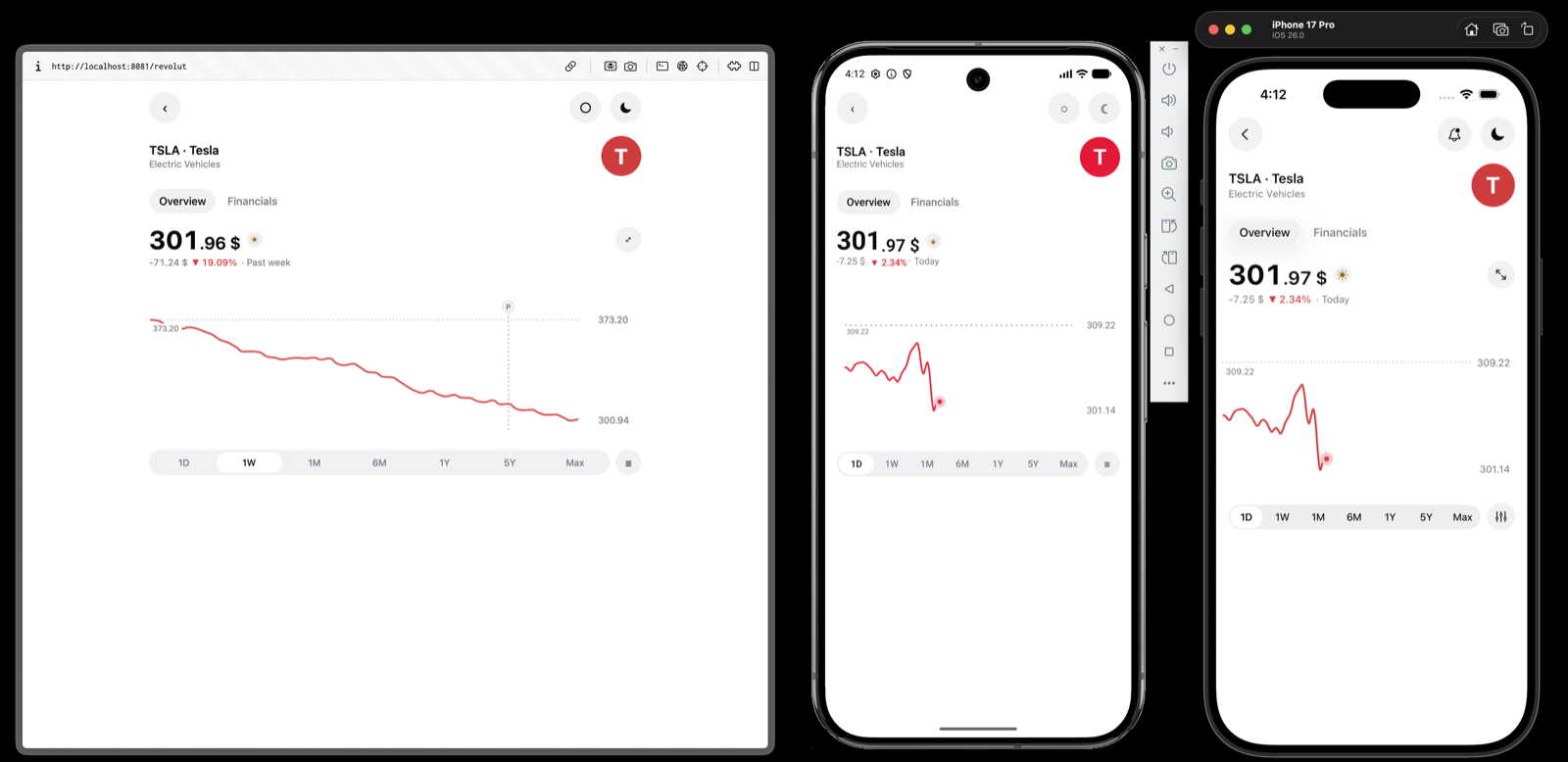
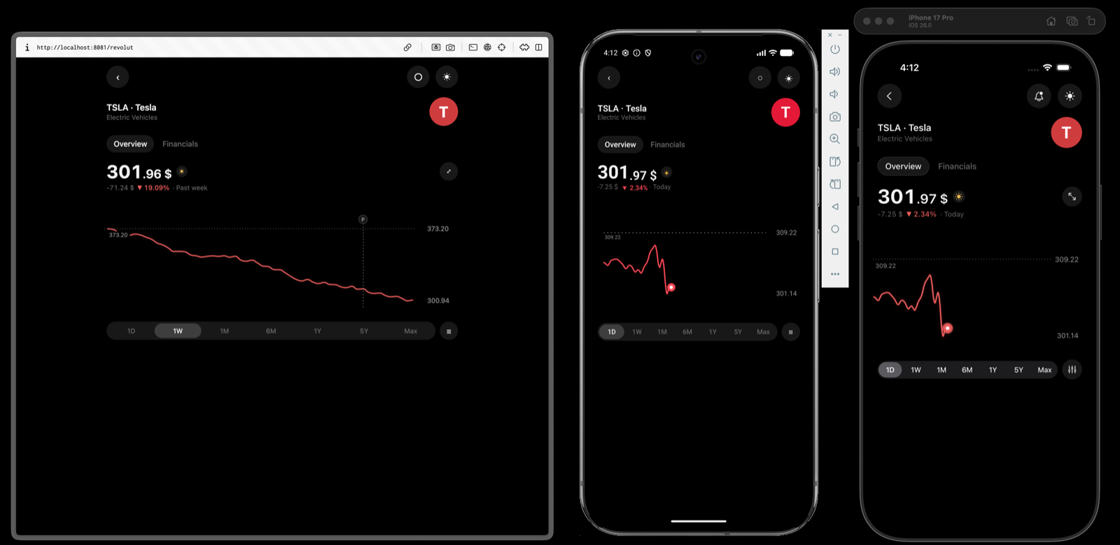
The example app ships a full stock quote screen in the shape Revolut's has: a headline price that follows the finger, a smoothed intraday line that stops where the session does, a range selector, a candlestick toggle, and native tabs and headers above it all. It is the reference for what the native renderers are for — everything on the screen except the plot itself is ordinary React Native.
| Prop | Type | Default | Description |
|---|---|---|---|
Chart.Line | feature-charts/revolut-line-chart.tsx | — | The intraday price: smoothed, glowing, with a dashed baseline rule, an event badge, and a pulsing point at the last reading that useLastReading finds. |
Chart.Candlestick | feature-charts/revolut-candlestick-chart.tsx | — | The same screen switched to OHLC, with the candle width and radius measured off the design and the volume histogram left off. |
useChartScrub | apps/example/use-quote-readout.ts | — | Turns the scrub into the price, the delta and the date above the plot, and back to the resting reading when the finger lifts. No tooltip is drawn by either chart. |
geometry | apps/example/quote-chart-overlay.tsx | — | The reading card and the event badge are React Native views placed over the plot from the geometry the layout phase reports — not something the library draws. |
Platform files | revolut.ios.tsx · revolut.android.tsx | — | One screen per platform: SwiftUI through @expo/ui on iOS, Compose on Android, sharing the data, the theme and both charts. |
The study is split where the library's job ends. The charts, their styling, the theme and the generated quotes are a shared package — packages/feature-charts — so the three screens render the same Chart.Line rather than three copies of it. Everything around the plot is in the example app, one file per platform, and apps/example runs it on a device with yarn ios:example or yarn android:example.
App
A crypto price screen in the shape Kraken's has: a trace that runs off both edges of the window with no axes at all, a readout that follows the finger, and the two numbers the plot reaches under it. Where the Revolut study is about chrome — native tabs, headers and pickers around a plot — this one is about the plot itself, and it is the reason two things exist in the presentation vocabulary.
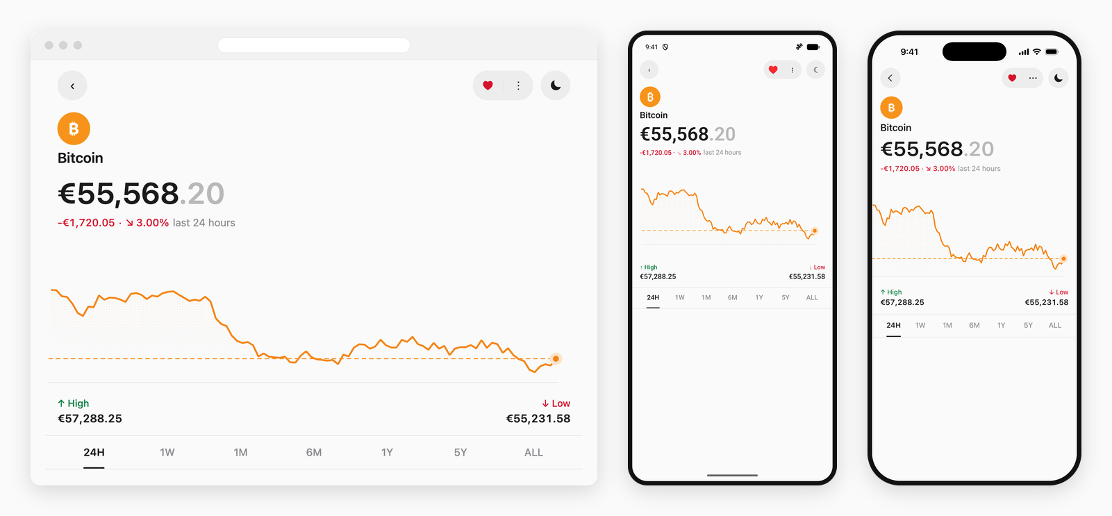
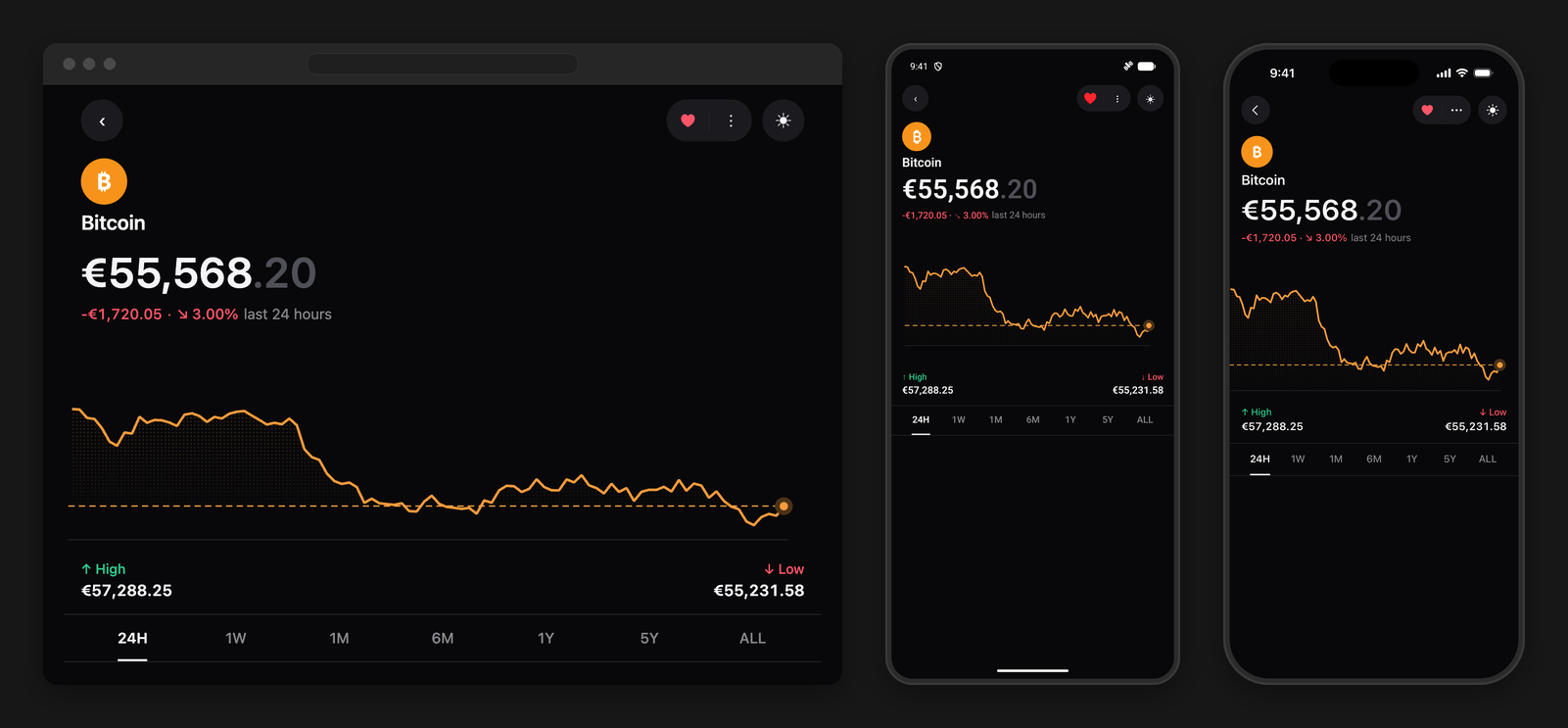
The area under the trace is a grid of dots rather than a wash, and it thins on the way down instead of stopping dead at the bottom of the plot — so the fill has one edge to read, the trace, and the grey rule on the floor is left to be the axis. Both come from one fill on the series style, and all three renderers draw it: a clipped dot grid on the SwiftUI and Compose canvases, a repeating canvas pattern on the web.
series({
  color: '#f48415',
  id: 'price',
  label: '24H',
  style: {
    fill: fill({
      // A tenth of its strength by the floor, so the paint gathers under the trace.
      fadeTo: 0.12,
      pattern: 'dots',
      spacing: 3.4,
    }),
    // A dot grid wants more opacity than a wash — most of what it covers stays bare.
    fillOpacity: 0.32,
    strokeWidth: 2.4,
  },
  values: range.values,
})Chart.Area still fills by default, because there the fill is the quantity. A fill on the series style is what puts one under a Chart.Line, where it is decoration — which is what let this screen keep the line chart's scrub, reveal and annotations.Dragging across the plot lights the trace from its first reading up to the finger and leaves the rest dimmed, so the line reads as the story so far. That is marker.trail — the third selection marker, next to the dot and the window-around-the-reading segment.
const scrubbing = (labels: readonly string[]) =>
  interaction({
    crosshair: 'x',
    // labels is one time per reading, in data order. The chart draws the one being read.
    crosshairStyle: { color: '#f8b877', labelColor: '#8b8b8b', labels, width: 1 },
    // What the trace fades to past the finger. Everything before it is redrawn at full
    // strength by the trail, so this is only ever seen ahead of the reading.
    dimOpacity: 0.66,
    haptics: true,
    hover: 'nearest',
    marker: marker.trail({ color: '#f48415' }),
    tooltip: false,
  })
The time above the crosshair is drawn by the chart, through crosshairStyle.labels — one string per slot, placed by whichever renderer is drawing the line. It is the one piece of scrub chrome the app hands back: a label pinned to the crosshair has to move with it, and a position that reaches JavaScript through a bridge and returns as a re-render is a frame behind the line beside it. The reading card on the Revolut screen has no such problem, because it sits still.
| Prop | Type | Default | Description |
|---|---|---|---|
Chart.Line | feature-charts/kraken-chart.tsx | — | The price trace: a dotted fill fading to the floor, a grey rule on that floor standing in for the axis, a dashed rule at the latest price, and a haloed point on the last reading. |
marker.trail | feature-charts/kraken-chart-style.ts | — | Lights the stretch of trace up to the reading and dims the rest, paired with dimOpacity so there is something for it to stand out from. |
fill | feature-charts/kraken-chart-style.ts | — | The dot grid and its fade, resolved per scheme: ink on paper carries at a fraction of what light on black needs, so dark asks for roughly twice the opacity. |
crosshairStyle.labels | feature-charts/kraken-chart-style.ts | — | The times above the crosshair, one per reading, handed over with the interaction so the label is drawn by whoever draws the line. |
useChartScrub | apps/example/use-kraken-readout.ts | — | Turns the scrub into the price and the delta above the plot. The change is measured from the window open; the dashed rule sits at the latest price. Two different questions. |
Platform files | kraken-coin.ios.tsx · kraken-coin.android.tsx | — | One screen per platform: SwiftUI through @expo/ui on iOS, Compose on Android, React Native on the web — sharing the data, the theme and the chart. |
Split the same way the Revolut study is: the chart, its style, the theme and the generated prices are the shared packages/feature-charts package, and the screen around it — in the example app — is one file per platform. apps/example runs it on a device with yarn ios:example or yarn android:example.
More
Every published version, its notes and the diff behind it are on GitHub: github.com/hzblj/zyplot/releases.
Versions are cut with changesets and published from CI with npm provenance, so the git tag, the GitHub release and the version on npm are always the same number. What changed in each one is also on this site.
More
New updates and improvements to Zyplot. The notes are read straight out of the package's own CHANGELOG.md at build time, so this page, npm and the GitHub release cannot disagree about what shipped.
Let the crosshair carry a label, so the text above it keeps up with the finger.
crosshairStyle.labels takes one string per slot in data order — a time, a date, whatever the reading is called — and every renderer draws the one for the read slot above the plot, in the same pass that draws the line. labelColor and labelSize style it. The app still writes the words; the chart only places them.
This is the one piece of scrub chrome worth taking back off the app. Everything else an overlay draws over a plot sits still long enough for onInteraction to place it — a card against a rule, a badge on an annotation — but a label pinned to the crosshair has to move with it, and a position that reaches JavaScript through a bridge and comes back as a re-render is a frame or two behind the line it belongs to. Reading the two together, the label visibly drags. Nothing about the overlay contract changes; this is one thing added to the side of it that was always going to lose that race.
Add fadeTo to the series fill, so the paint can thin towards the plot's floor.
An even fill has two edges: the trace along its top, and a hard stop along the bottom of the plot that no data put there. On a chart with no axis to speak of the second one reads as a second line, and the eye keeps going back to it. fill({fadeTo: 0.12}) takes the fill down to a tenth of its strength by the floor, so it gathers under the trace and lets go.
The three renderers get there differently. The SwiftUI and Compose canvases paint the dot grid a row at a time, which is the largest unit that can share an alpha — one path per dot would be thousands of draw calls a frame, and one path for the grid can only carry one. ECharts is given a tile as tall as the plot and repeated only across, because a tile that repeated vertically would restart the ramp every few pixels; that needs the plot height before the chart is measured, so it is computed from the same gutters the grid reserves and a chart given no height keeps an even fill rather than guessing at one.
Add marker.trail, a selection marker that lights the trace up to the reading.
marker.segment brightens a window span steps either side of the mark under the finger, which reads as light moving along the data. That is the right shape when the reader is comparing a point against its neighbours, and the wrong one for a price chart, where the question is what has happened _so far_ — everything before the finger is history, everything after it has not been reached yet.
There was no way to say that: the window is symmetric in all three renderers, and dimOpacity fades the whole line at once. marker.trail lights from the first datum to the reading instead and leaves the rest at dimOpacity, on Swift Charts, the Compose canvas and the web. It takes neither span nor size — its far end is the reading and its near end is the start of the series, so there is nothing to size.
Both stroke-lighting styles are drawn over the line rather than beside it, so both still need a dimOpacity to stand out from. The iOS and Android selection-marker views now treat a trail the way they already treated a segment, and draw no dot of their own on top of it.
Make transition: 'morph' do something on iOS and Android.
ChartTransition has offered 'crossfade' | 'morph' since the contract was written, but only crossfade was ever implemented. Asking for a morph did not fall back to a crossfade — it fell through to no animation at all, and the plot cut from one dataset to the next.
Both platforms now blend the two: the readings, the pinned axis domain, and the value a rule or a point sits at, so nothing on the plot jumps while the trace is on its way. Annotations are matched by id — one that exists on both sides slides, one that does not simply arrives. A morph needs the two sides to correspond, so where the series count or the reading count differs the new dataset is shown as it is: half a morph reads worse than none.
animation({duration, easing}) times it, the same two that time the entrance and every other data change — so a morph is tuned from the props rather than from a curve baked into the renderer. 'spring' resolves to the eased curve: there is no closed form to sample at a fraction, and a transition that overshoots would carry the marks past their new values and back.
The frames are produced rather than animated towards. SwiftUI and Compose both interpolate _modifiers_; a fraction fed to a _data_ computation is set straight to its final value and the body runs once, which is an animation that never draws a frame. iOS runs the clock off a TimelineView, the way the traced reveal does, and parks the schedule whenever nothing is moving. Android reads the clock inside the canvas, so a morph costs a draw a frame rather than a recomposition of the chart around it.
Implicit animation is switched off underneath the iOS morph — the chart's own update animation with it, which is the one that mattered. An animation keyed on the data is handed a new target on every frame of a morph and spends the whole morph chasing it: the trace is drawn from the frame directly and lands on time, while every mark Swift Charts owns arrives a beat late and keeps moving after the line has settled. The rule at the latest reading showed it worst — it hung at its old price and then slid down once the morph was already over. Compose draws straight from the frame it is given, so it never had the second animation to switch off.
A morph cut short sets off from what is on screen rather than from the dataset the last one was heading for. A row of range buttons gets pressed in sequence, and snapping back to the window before to set off again is a jump nobody asked for.
Two datasets only correspond if they agree on how many readings they have. A screen that switches between windows of different lengths — a day against a year — has to sample them into the same number of slots to be morphed between; otherwise this stays a crossfade.
transition stays a native choice, and is now documented as one. The web renderer transitions a data change itself, mark by mark: the ones on both sides move, the ones on one side fade. That is a better answer to a changed axis than dissolving the whole plot, so a web chart does it whichever name it is given — including for the same animation object an app shares with its native screens.
Add fill to the series style: a dot-grid pattern, and a baseline other than the plot floor.
fillOpacity was the whole vocabulary for the area under a line, and it only did anything on Chart.Area, where the fill runs to the bottom of the plot because there the fill is the quantity. Two things a price chart wants were unsayable.
A fill can now close against a value — fill({baseline: latest}) — so the shape between the trace and that number is filled above the line and below it, and reads as distance from where the asset stands rather than as volume. And it can be laid down as a grid of dots rather than a flat wash — fill({pattern: 'dots', spacing: 3.4}) — which carries a fill across a pale background without the second, fainter chart a wash leaves behind it.
fill lives on NativeChartSeriesStyle next to glow, so every entry point takes it, the web one included: a clipped dot path on the SwiftUI and Compose canvases, a repeating canvas pattern on ECharts. Opacity is still fillOpacity — one spelling — though a dot grid usually wants more of it than a wash, since most of what it covers stays bare.
Giving a series a fill also paints an area under Chart.Line, where it is decoration rather than the quantity. Chart.Area is unchanged: it still fills by default, and a fill only overrides the pattern and the baseline.
Stop Android drawing grid rules for an axis that asked not to be drawn.
yAxis={{visible: false}} took the labels off the Compose canvas and left the rules behind: drawGrid only ever consulted yAxis.grid, which defaults on, so a chart meant to be read off its marks alone came out with five grey lines across it — and only on Android, since Swift Charts and ECharts both drop a hidden axis' grid with the rest of it. A plot styled to bleed off the window showed the divergence at its clearest: the rules stopped short of the right edge, where the axis' end padding is.
The grid now follows the axis. grid still turns the rules off on their own for an axis that is drawn, which is what a chart wanting labels without rules already passes.
Draw the Android crosshair and selection marker wherever the scrub reaches, not only where the finger happens to land inside the plot.
Both asked whether the plot _contained_ the pointer and drew nothing when it did not, while the reading itself is picked off the pointer's x alone and clamped into the plot on the way. So a finger in any of the four bands the plot is inset by — 20dp at the leading edge, 16dp at the top, 24dp under the marks — moved the trace, lit the trail and reported a reading, and put neither a line nor a mark nor a label on the chart to say which one. On a plot the height of a headline that is a quarter of the chart's own height, and it includes the two edges a finger is most often taken to.
Rect.contains is half-open besides, and a scrub is clamped to exactly plotRight — so the last reading, the one the end dot marks, was one of the dead bands.
The pointer is now brought onto the plot rather than tested against it: the line stands at the edge and stays there while the finger goes on past, which is what the reading does too.
66541abStop an Android scrub dying on the redraw its own first report causes.
The Compose gesture detectors, the scrub state and the entrance animation were all keyed on the configuration string — the whole serialised payload. That holds while a chart is only read from, and breaks the moment an app answers onInteraction by changing the chart: a dimmed end dot, an annotation moved to the reading, anything at all. The first touch reports began, the app re-renders, a new string arrives, and Compose tears down the pointerInput under the finger. A detector restarted mid-gesture is waiting on awaitFirstDown for a finger that is already down, so every move for the rest of that drag goes nowhere. Lift and touch again and it works, because by then the payload has stopped changing — which is why this read as a scrub that took two goes rather than one that was broken.
The scrub and the entrance now key on the dataset, the way the morph and crossfade already did — the entrance on the end of the loading skeleton as well, which is the other moment a chart is first seen — and the detectors are started once and read the current handlers rather than the ones composed alongside them. A change of data still clears the reading and still plays the entrance; a change of styling or annotations no longer touches either. The entrance also stops being restarted mid-scrub, which on a chart with animation.delay set was holding the trace at nothing for the length of that delay on every touch report.
iOS was never affected: SwiftUI holds the selection in @State on a view whose identity does not depend on the payload.
Put the axis labels back on every web chart drawn through ECharts.
A gutter axis — the default on both dimensions — asked for no label inset, and asked for it by handing ECharts axisLabel.margin: undefined. An option given explicitly wins over the engine's own default even when it holds nothing, so the 8px gap the labels are laid out from went missing, and every label on the axis was placed at the canvas' corner rather than beside its tick: a pile of overlapping text clipped by the plot's leading edge, no scale to read anywhere, and a plot pushed down the canvas by the room the same measurement asked for.
The inset is now set only where a chart means to move a label — an 'overlay' axis, against the plot's trailing edge — and left off entirely everywhere else. Chart.Candlestick built its category axis by hand and carried the same bug, including for an overlaid axis that named no labelInset; it now takes the shared inset with the rest.
Give Chart.Candlestick a placeholder shaped like a candlestick chart.
Chart.Candlestick.Skeleton was BarChartSkeleton, and so was the placeholder the chart itself drew while loading: a row of bars grown from the baseline. A candle does not sit on the baseline — it floats on its wick — so the shape that landed was never the shape that had been promised, and the swap moved every mark on the plot.
The candlestick now has its own: bodies of varying height, each centred on a wick, each offset up or down the plot the way a real series wanders. Nothing to configure — like the other placeholders it is derived from the props the chart already has.
66541abStop the iOS crosshair label being written off the edge of the window.
The label is centred on the line, and a line read near the start of a series puts half of a date off the left of the screen — Feb 6, 2026 arriving as b 6, 2026. Android has always pinned it inside the chart's own bounds; iOS laid it out as a fixedSize overlay on a hairline, which is a box with no width to be constrained by, so nothing ever stopped it.
It now stops when its own edge reaches the view's, on both platforms and at both ends: the label follows the line until it would hang off, then anchors against the edge and stays whole while the line goes on without it.
Where it stops is worked out as arithmetic and applied as a shift off the line, rather than written back as an alignment guide: an overlay places its content by the alignment it was given, and a guide the content returns does not reach it. The width that arithmetic needs is measured off the font the label is drawn in, so it is the width the label actually takes.
66541abStop the iOS area fill from dimming while a point is being read.
dimOpacity is how far the data the reader is _not_ on steps back, and on the web and on Android it has always applied to the stroke alone. iOS applied it to the whole line canvas, so the area under the trace faded with it — which greys the page rather than pointing at anything, because the fill is the ground the trace is drawn on and not one of the marks being compared. The three renderers now agree.
Stop a hover from dimming a web line chart's fill, and from dimming its stroke twice.
dimOpacity says how far the data being read steps back, and the pointer layer applies it where it belongs: the stroke, on the series' resting style. Chart.Line was also handing ECharts emphasis.focus, which puts the series into its own blur state on hover — and that state takes the whole series down, areaStyle included. A line with a fill under it lost both at once, and the stroke was dimmed twice over, once by each mechanism.
A chart that names dimOpacity is saying it will do the dimming itself, so ECharts' focus is now switched off when it does. Charts that name no dimOpacity are unaffected and keep the focus behaviour they had.
Let isLoading={false} keep the first-frame placeholder off the page.
A web chart cannot paint until it has read its colours off the document, which happens in an effect, so the built-in placeholder covered that first frame for every chart — including one mounted with its data already in hand. On a page that swaps charts as you click through them the cost is visible: a grey shape fades in and out again for a chart that was never loading.
An explicit isLoading={false} on the first render now opts out of the placeholder for good, and the plot fades in on its own. A chart that says nothing about loading keeps the old behaviour, which is what a server-rendered page wants: markup to paint before hydration. One that starts true and later flips to false still cross-fades — the placeholder it was showing stays mounted to fade out.
Export fill from @hzblj/zyplot/ios and @hzblj/zyplot/android too.
The builder landed on the shared entry point and the web one and was left off the two platform subpaths, which are the entries a file already committed to a platform imports from — so the screens most likely to want a dotted fill under a trace were the ones that could not name it without reaching back to @hzblj/zyplot. Every other builder is on all four, and the docs say so; this one is now as well.
Give Chart.TimeSeries the same axis spacing as every other form. Its value band was a fixed 48px — uPlot takes a width, not a measurement — so a two-digit scale sat a long way off its plot while the ECharts forms beside it kept their labels 8px away. The band is now measured from the widest reading in it, in the font the chart paints, and both axes take the same 8px gap the rest of the library uses.
Honour animation on every web chart, not five of them.
ChartBaseProps has always declared it, and Chart.Line, Chart.Area, Chart.Bar, Chart.StackedBar and Chart.Candlestick have always read it. The other thirteen forms — pie, scatter, heatmap, histogram, boxplot, diverging bar, dumbbell, funnel, gauge, radar, sankey, sunburst, treemap — built their options without it, so duration, delay and easing went nowhere and enabled: false turned nothing off. They animated on the renderer's own defaults: a full second of cubicOut, whatever the chart had been told.
A page that sets one animation for every chart on it now gets one animation for every chart on it.
66541abGive a web annotation badge the room it needs, and the rule beneath it.
The badge was centred on the plot edge the rule starts from, which put half the circle outside the canvas: on the web that edge is where the drawing stops, so the glyph read as sliced off the top. It now sits a radius inside the edge, the same place iOS and Android hold it, and the whole circle is on the plot.
It also draws over the crosshair and the marks rather than under them. A rule capped by a badge is a pin, and a pin reads that way only while nothing crosses its head — the crosshair, which is drawn full height, went straight through the glyph whenever the pointer stopped on the annotated slot.
66541abKeep web annotations on the marks they belong to while the data changes.
Three separate reasons a rule or a point came off the trace on the web, all of them visible on the same range switch.
A point annotation is drawn by the chart itself rather than handed to the renderer — that is what gives it a halo, a glow and a pulse, none of which a markPoint has. It was built from the plot's new scale, so it arrived at the new reading the frame the option landed, while the trace under it was still travelling: a dot hanging in the air above the line for the length of every data change, and a badge hanging off the rule it caps. It now travels there instead, over the same length and along the same curve as the marks, and still snaps when the plot itself has moved — a resize is not a data change and there is nowhere to travel from.
easing reached the entrance but not the data change: those are two different keys, and without the second one every update ran on the renderer's own cubicInOut however the chart had been timed.
A rule is matched across a data change by name, and a rule with no label had none to be matched by. Two of them and the renderer cannot tell which is which — one is drawn again from nothing instead of moving to where it now belongs, which is the rule that flickered and re-entered rather than sliding. They carry their id now, which is the thing that identifies them and is always there.
Give the crosshair's label somewhere to be drawn on the web.
crosshairStyle.labels places the words above the plot's ceiling, which is where they belong and where iOS and Android put them: those draw over the chart's own view, and a view carries on past the plot in every direction. A canvas does not. The label was hung upwards off a line eight pixels below the top of the chart, so all of it was painted off the top and none of it was ever seen — the crosshair arrived on the web with no words on it at all.
The plot now gives up the room the label needs, measured from the same two numbers the label is drawn with, so the space and the text cannot drift apart. Only a chart that was given labels gives anything up, and it gives it up whether or not a pointer is over the plot — marks that changed height the moment one arrived would be worse than either.
The label is also kept whole against both edges, the way iOS pins it. A crosshair reaches the ends of the plot and a date is wider than the hairline it names, so the first and last readings of a series were worth half a label each.
66541abStop reveal.fade from painting the stroke out again on the web.
A fade entrance starts the line at lineStyle.opacity: 0 and runs a tween that lifts it back to full. The tween runs once, by design — the entrance belongs to the first render — but the zero was written into the option on _every_ rebuild, so the first change of range, theme or data after it had finished set the stroke back to nothing with nothing left to bring it up. The line vanished while its fill, annotations and axes stayed, which reads as the chart having lost its data rather than as an animation bug.
'draw' already guarded its own startOpacity behind hasPlayed; 'fade' now does the same. This only ever affected charts that asked for reveal.fade explicitly — a chart with no animation.reveal never took the branch.
Let a web line chart's marks travel to a new dataset again once its entrance has run.
A data change was supposed to move the marks reading by reading. It cut instead — the whole trace at the new dataset the frame the option landed — while the rules and the points drawn over it travelled the full length of the change on their own. So a range switch read as the plot jumping and its annotations then sliding into place after it, which is the opposite of what transition: 'morph' promises anywhere else.
The cause was the entrance, of all things. A fade is the stroke's own opacity changing after the marks have landed, which no option covers, so it is driven frame by frame and written back through setOption — and each of those writes has to turn the renderer's update tween off, or every frame of the fade is chased by one. That key is merged into the read series and stays there. Once an entrance had run, the series had no update animation at all, for the life of the chart. Everything drawn over it kept the chart's own timing and travelled, which is why the two came apart rather than both cutting.
How a data change is timed is now restated on the series as well as on the chart, so the option after an entrance puts back what the entrance took away.
Also fixed: the first frame of a fade painted the trace at full strength. A frame's timestamp is when that frame began, which can be before the fade was asked for, and an unclamped ease-out of a negative elapsed is a negative opacity — not dim but invalid, which a canvas answers by keeping whatever alpha it had.
Keep a web scrub's dim, its lit stretch and its stepped-back marks for the whole gesture.
The pointer layer says how the plot reads while one mark is being read — the trace steps back to dimOpacity, the marker relights the stretch that has been got to, and any annotation that asked to comes back with it — and it said it once, at the start of the gesture, by patching the chart's option. A chart builds that option for a plot at rest, so the next one to land merged every one of those away again.
Which sounds rare and is not. An app is told which reading is being read, and anything it does with that comes back to the chart as a prop: the screen this was found on dims its end dot once the finger leaves the last reading, so the very first scrub event rebuilt the option and undid the dim that same frame. What was left was a crosshair over a plot that had not otherwise reacted — and a lit trail the same colour as a trace that was never dimmed, which is a trail nobody can see. The gesture's state is now restored whenever a new option lands under it.
scrubOpacity also reaches the marks the chart draws itself rather than handing to the renderer — a point with a halo, a glow or a pulse, and the badge that caps a rule. iOS and Android fade every annotation that asks; on the web the reference lines faded and those did not, so a dot marking the live reading stayed lit while the answer was being read somewhere else. Two marks, one question.
Draw a web reference line solid when it was not asked to be dashed.
annotation.line() with no dash is a solid rule, and is one on iOS and Android. On the web it came out dashed, because a reference line is the one thing ECharts has an opinion about: its markLine defaults to 'dashed', and the key was handed over holding nothing — which leaves a renderer's own default standing rather than overriding it, the same trap the axis label margin was in. The rule standing in for an axis on a plot that has none was a row of faint dashes instead of the hairline it was written as.
Make sure a web chart's stylesheets actually reach the page, which is what Chart.TimeSeries was missing to draw at all.
The two stylesheets a chart needs were imported by the web entry point, which does nothing but re-export. A bundler is free to read a re-export, resolve the symbol to the module that declares it and never run the file in between — Turbopack does exactly that — so an app got the charts and none of the CSS. uPlot's is structural: without it the plot is not positioned, the canvas is not scaled to its box, and Chart.TimeSeries painted a stretched grid and giant axis labels sliding out of the card with no line in sight. They now sit with Chart itself, reached by the same import that reaches a chart, which no tree shake can drop.
That stylesheet now arrives in the base cascade layer, because an app with Tailwind of its own ends up holding two builds of the same utilities under the same names, and this one — pulled in by a chart — comes second. A plain .flex or .hidden from here beat the app's own dark:block and min-[821px]:hidden on the app's own markup, since a variant carries no more weight than the utility it varies: dark-mode pages showed their light-mode element, and elements meant to be hidden at a width stayed on screen. In base these lose to everything an app writes, while a page whose only stylesheet is this one renders exactly as before.
Give an annotation label a chip and a side that keeps it readable. labelBackground paints a rounded fill behind the label, so a rule's value stays legible where the marks run through it, and labelPosition: 'auto' picks the side from where the rule sits: above it in the lower half of the plot, below it higher up. Fixed sides still win when named, so nothing changes for annotations that already pass 'top' or 'bottom'.
Let a rule annotation set its own thickness. width joins dash and color on ChartLineAnnotation, honoured on iOS, Android and the web — the line width was pinned at 1 in the native drawing code, so a reference line could be dashed and coloured but never made heavier or lighter than the hairline it started as.
Android drew both the width and the dash lengths in pixels while they are given in dp, which on a 3× screen made a dashed rule a third of its asked-for thickness with a third of its asked-for dash; both are scaled now.
54b15f6Put your own component where an annotation lands, with annotationViews.
The chart already reported where every annotation ended up, and an app that wanted a logo at the live reading or its own head on a rule had to take it from there: hold the geometry in state, absolutely position a view over the plot, keep the two in step. That work was the same every time, so it lives in the chart now. Key a node by the annotation's id and it is centred on the spot, moves with the data, and the mark the chart would have drawn there is left out — one prop instead of an overlay of your own.
tsx <Chart.Line annotations={[ annotation.point({ id: "live", x: live.category, y: live.value }), ]} annotationViews={{ live: <LivePrice value={live.value} /> }} categories={categories} series={series} />
The annotations you leave out keep the dot, glow and pulse the renderers draw, on all three platforms, and nothing about the built-in marks has changed. An annotation can also be an anchor and nothing else: hidden: true keeps it measured and reported in geometry while drawing none of it, which is what a view of your own placed by hand — a card following the finger, say — wants underneath it.
Charts that draw annotations but had no pointer layer to measure them (Chart.Area, Chart.Bar, Chart.StackedBar on the web) now report geometry on the 'layout' phase like the rest, so the views land there too.
Report where the plot and its annotations ended up, so an app can draw its own overlays instead of the ones the chart bakes in. Native charts now emit a 'layout' phase carrying geometry — the plot's box and every annotation's position, in the chart view's own coordinate space — and useChartScrub returns it as geometry alongside the selection, which also carries the pointer's nativeX/nativeY now.
That is enough to place any React component over the chart: your own badge on an event annotation instead of the built-in glyph-in-a-circle, your own card at the reading under the finger, a logo, a button, whatever the design asks for. Leave badge off the annotation and the chart draws only the rule, leaving the head to you.
Let every entry point hand over the whole contract, not most of it.
@hzblj/zyplot/ios and @hzblj/zyplot/android re-exported the shared types and Chart, and then stopped: the builders and useLastReading are values, and export type * does not carry a value. So the import the documentation shows for a platform file — import {annotation, Chart} entries now export the fifteen builders and useLastReading alongside useChartScrub, so a *.ios.tsx file needs one import rather than two.
@hzblj/zyplot/web re-exported a hand-kept subset of the shared types, and several a web chart actually needs were missing from it: ChartCandlestickDatum and ChartCandlestickStyle, which Chart.Candlestick takes; ChartRangeAnnotation and ChartTextAnnotation, two of the four members of the union annotations is; StyledChartSeries, what the series builder returns; and the small unions the documented shapes are written in terms of — ChartSymbol, ChartAxisScale, ChartCoordinate, ChartSurfacePadding and the rest. Typing a candle array or a helper that returns a range annotation meant importing from @hzblj/zyplot-core directly. They are all re-exported now.
Chart.TimeSeries was also the one web form whose list prop stayed mutable: its series is readonly Omit<ChartSeries, 'values'>[] now, like every other list the web charts take.
Two knobs for reading a candlestick chart. interaction.highlightBlend says how far the read mark is lifted towards interaction.highlightColor, so at 0.5 a red candle lights up red instead of turning white — a flat replacement threw the series colour away, which is the one thing a candle's colour is for. style.candleRadius rounds the candle body, and rounds the wick's caps with it so the wick does not read as a cut-off stub against a rounded body.
Let the mark under the pointer light up. interaction.highlightColor draws the read mark in its own colour, so a scrub reads as one candle lit rather than as every other candle merely dimmed — dimming alone leaves the read one in its resting colour, which is hard to pick out against a plot that has only lost a little contrast. Implemented for candlesticks on both platforms, alongside the dimOpacity fix that made the rest fade at all.
Draw with the theme's font on iOS and Android, and read the last three theme colours everywhere.
theme.typography.fontFamily reached only the web renderer before: the native ones decoded colors and dropped typography on the floor, so a chart beside a <Text> in the app's own font drew its axis labels in the system one. Both now resolve the family the way their platform resolves text — iOS through the registered-font lookup behind UIFont(name:), Android through React Native's ReactFontManager, which covers assets/fonts, res/font and anything expo-font registered at runtime. A family the app never shipped falls back to the platform font, exactly as a canvas does on the web. It reaches every string either renderer draws: axis labels and titles, tick labels, annotation labels and badges, rule labels, the tooltip and the gauge reading.
Three colours were also being decoded and then ignored:
- axis now colours the tick marks on both platforms. Android drew no ticks at all until now, so its ticks axis option had nothing to switch off; it draws them beside every label the x and y axes place, an overlaid y axis excepted — it reserves no gutter for one to sit in. - surface now fills the tooltip card. It replaces the hardcoded near-black on Android and the system material on iOS, which is still what a chart with no surface in its theme gets. - background now paints the plot on Android when no plot.backgroundColor overrides it, the order iOS already resolved in.
Give each theme shape a name of its own. @hzblj/zyplot/web exported two incompatible types called ChartTheme — the wide palette Chart.Provider takes, and the narrower one a chart's own theme prop takes — and the explicit export won, so a value annotated ChartTheme was not assignable to the prop of the same name.
There are now three, and the two wider ones are supersets of the portable one, so a single object can be passed to any of the three props:
- ChartTheme is the portable subset: axis, categorical, grid, label, negative, positive, surface, track, and typography. Every key on it is one all four renderers draw with. Its colours are ChartThemeColors, exported for building a theme up in parts. - NativeChartTheme adds colors.background, the chart's own fill, which only a native surface paints. background has moved here off ChartTheme: the web renderer never drew it, and the box a web chart sits on is surface.background. - ChartProviderTheme adds border, diverging, muted and sequential — the palettes and greys that only a CSS variable can carry — and is what the web Chart.Provider takes.
Chart.Provider also reads the flat negative and positive now, as the shorthand for diverging.negative and diverging.positive. Passing the five-key diverging object still wins over them, so setting both is not ambiguous.
Give the pulse on a live point a rhythm, and hand it over. pulse on a point annotation now takes a ChartPulse — color, duration, interval, opacity, scale — as well as the true it took before, and true now means one bloom of 450 ms followed by a rest of 1550 ms, at 2.2× the point's resting ring.
That replaces a single 1.8 s expansion that faded to nothing with no rest between cycles: the ring spent almost the whole cycle nearly transparent, which read as no animation at all. The ring's colour is settable too, and falls back to the glow's colour and then to the point's own — on iOS a pulse with no glow used to inherit the glow's .clear and draw nothing at all.
Android had no pulse to speak of — the parameter was threaded through the drawing code but nothing ever animated it — and now draws the same bloom off the same clock.
54b15f6Make the data shapes one contract across web and native. The web entry point had its own copies of ChartSeries, ChartDatum, ChartTimePoints and the other per-form inputs, identical to the ones in @hzblj/zyplot-core except that their arrays were mutable. It now re-exports the core types, so a value typed once can be handed to a web chart and a native one.
Every web chart prop that takes a list — series, categories, data, nodes, cells, groups, rows, values — now accepts a readonly array, as the native props and web's own Chart.Candlestick already did. Passing an as const array or the result of a readonly-returning selector no longer needs a cast.
Let the entrance name its own curve. reveal.draw and reveal.fade take an easing — 'ease-in' | 'ease-in-out' | 'ease-out' | 'linear' — and reveal.draw also takes a flashEasing for the glow's decay. Both were hard-coded before: a trace always ran at a steady speed, a fade always eased out, and the flash always shed most of its bloom in the first frames after landing, which reads as the glow leaving while the trace is still arriving. flashEasing: 'ease-in-out' keeps the bloom up a moment longer so it leaves in one piece.
A spring is deliberately absent from ChartRevealEasing: an entrance that overshoots would trace past the last data point and come back.
Defaults are unchanged — 'linear' for a trace, 'ease-out' for a fade and for the flash — so existing charts animate exactly as before.
Make the web renderer read a pointer the way the native ones read a finger, so a screen built on a scrub is one screen on all three platforms rather than two.
useChartScrub is now exported from the web entry point as well. The scrub lifetime is no longer native's alone: ChartInteractionEvent carries phase, index and geometry on every platform, and Chart.Line and Chart.Candlestick report them from the pointer — 'began' when it enters the plot, 'changed' as it moves, 'ended' when it leaves, and 'layout' with the plot's box and every annotation's position once the chart has measured itself. NativeChartInteractionEvent stays as a name for the same shape.
The web props also take the fuller presentation vocabulary they were previously typed out of, and the renderer honours it:
- interaction.marker lights the mark being read — a stretch of the line for marker.segment, a bloom behind the candle for a mark that has its own body — with crosshairStyle, dimOpacity, highlightColor and highlightBlend around it. - animation.reveal traces a line open: trackColor lays the shape down first, and flashColor with its glow, hold and decay lands with the frontier and then leaves. - annotations draw their glow, halo, pulse, badge, label, labelBackground, labelPosition and scrubOpacity. - axis.overlay puts the tick labels inside the plot at labelInset, tickValues pins them to exact readings, and plotDimensionStartPadding/plotDimensionEndPadding keep the marks clear of them. - seriesStyles[id].glow blooms behind a stroke, and style.candleWidth/style.wickWidth size a candle. style.candleRadius is the one prop the web cannot honour: ECharts draws a candle as a single path with no corner radius to give. - Every chart takes a theme of its own, merged over Chart.Provider's, so a preset that carries colours can be handed to a web chart and a native one alike.
Give Android candlesticks the entrance they already had on iOS. A traced reveal pins the growth factor at 1 — the trace is meant to come from the reveal's own fraction — but the candlestick drawing never received it, so reveal.draw drew every candle at once while iOS brought them in left to right. Candles now land one slot at a time off the same fraction, with the slot width keyed to the full count so nothing re-spaces as they arrive.
Draw Android charts at the size they were asked for. Every absolute number a chart takes — plot padding, axis gutters, stroke and wick widths, annotation dot and halo sizes, glow radii, badge and label geometry, marker sizes — is authored in dp, but the Compose canvas measures in pixels and the drawing code used the two interchangeably. On a 3× phone that made all of it a third of its intended size: a 6 dp live dot drew at 2 dp, a 42 dp glow barely left the stroke, and the axis gutter was too narrow to keep labels off the trace. Pointer hit-testing had the same mismatch, since the plot box was measured in dp and compared against a pixel pointer.
The geometry an app lays its own views out with is now reported in dp, matching iOS's points, so an overlay positioned from useChartScrub's geometry and nativeX lands where the chart drew rather than a screen away.
Let an annotation badge cap its rule instead of sitting on it. The badge was placed a default annotation gap below the plot edge, so a stub of the rule stuck out above it and the dashes ran straight through the circle — the glyph read as floating in the plot rather than as the rule's head. It now sits flush with the plot edge, and the rule starts below it: on Android the rule is drawn from under the badge, and on iOS the badge paints the chart's plot (or theme) background behind itself to mask the part it covers. Charts with a transparent plot background keep the previous translucent badge, since there is nothing to mask with.
54b15f6Honour interaction.dimOpacity on a candlestick chart. It faded the marks on every other form but did nothing here, so reading a candle left the rest of the series at full strength and the read one hard to pick out. Candles either side of the selection now fade back the same way series marks do.
Stop painting canvas text in the browser's serif when the page declares no font.
A web chart reads the font in effect where it sits and hands it to the canvas, which is what makes it match the type around it. When nothing up the tree declares a font, though, that read answers with the user agent's default — a serif — and the chart drew its axis labels in Times beside text that was not.
React Native Web is where this shows: its reset puts no font-family on html or body and gives each <Text> the system stack through a class of its own, so an Expo web app has nothing for a chart to inherit however deeply it looks. Every chart in one rendered its numbers in Times.
The inherited font is now compared against what the browser resolves with no author styles in play, and falls back to system-ui and the platform stack behind it when the two match. A page that does set a font is untouched: inheritance still wins, and --zyplot-font-family and theme.typography.fontFamily still override both.
Things the renderers drew that they were never asked to.
The web entry point imported a stylesheet that only gathers two others with @import, and not every bundler follows those in development — Metro leaves them out, so a chart came up with no styles at all. That loses the layer its placeholder and its plot share: the two stack up instead, and everything an app positions over the plot is measured from a canvas that starts a placeholder's height too low. It now imports the built stylesheets themselves.
Chart.Line put a symbol on every reading. Its own documentation said symbols appear on hover, and the native renderers draw none — a dot per datum is a mark the reader did not ask for. Set seriesStyles[id].symbol and they come back.
A range or text annotation drew nothing at all, because the components that render them were never registered with ECharts. They are now. A reference line's label showed the value it sits on rather than the label given to it, which dropped a trailing zero from a price; and with an 'overlay' axis it printed that number a second time, on top of the axis' own — labelPosition: 'auto' now keeps it at the rule's leading end, away from them.
Scrubbing a candlestick chart left every candle the pointer had passed still lit, because ECharts' highlight adds to a set rather than replacing it. The bloom behind the read mark was a flat fill with a shadow around it, which reads as a box sitting behind the candle however soft its edges are; it is a radial gradient now, which has no edge to read.
A traced entrance ran behind the placeholder, so the plot cross-faded in with the trace already part-drawn — or already finished, depending on which won the race. The marks now wait for the placeholder to go. Its flash was also rebuilt at full strength whenever the data changed, and nothing was left to put it out: a chart that had already made its entrance kept the glow for good.
On Android an overlaid axis reserved a gutter for its labels _and_ kept plotDimensionEndPadding clear of them, so the marks stopped a label's width further from the edge than on iOS. An overlaid axis reserves no gutter — that is what overlaying means.
Add repository metadata and a bundled LICENSE file to both published packages. npm verifies a provenance-signed publish against repository.url, so the missing field left @hzblj/zyplot-core unpublishable.
First public release.
Cross-platform React charting behind one package and one shared TypeScript contract: ECharts and uPlot on web, Swift Charts on iOS, and Jetpack Compose on Android, with both native renderers reached through a single Expo Module named Zyplot.